Backoffice Product List table user interface uplift

Context

As part of the network inception work, we’ve run interviews with producers and hub contributors, asking open ended questions and showing some digital prototypes. Among other interview highlights, some of the positive feedback we got was around a cleaner user interface for the product list, and consolidating the functionality available in the product list with what’s in inventory. This is good feedback, since we would like to move away from the Inventory functionality altogher. It’s hard to understand for users, it has been adopted from some when it’s not actually needed, and it also present some technical challenges that we want to minimize in the future.
In parallel, an extensive discussion around a new UI (user interface) for the backoffice regularly keeps coming up.
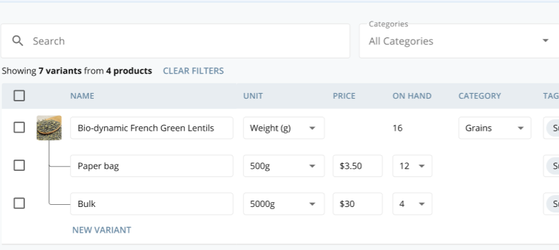
So here’s a proposal to rebuild the product list table, possibly with a new technology (React), that would be easier to use, and would start to include a tiny bit of inventory functionality.
In the future we might bring more, but let’s start small and see if people like it first.

What is the need / problem?

Some users are using inventory when it’s not actually needed, simply because the interface is easier to use.
On the flip side, the product list has several interaction flaws that makes it clunky to use.
From a tech architecture point of view, we want to move away from the inventory data model, so reducing the number of people using inventory, and one day removing it, would be great.

Who does it impact?

Pretty much every backoffice user.

What is the current impact of the problem?

Hard to assess, since many users are affected. From a product strategy point of view, it’s an underlying blocker for us, evolving into the true network side of the platform.

What is the benefit of focusing on this?

Improved day to day usage of the backoffice with time saving benefits for users.
First step into revamping the backoffice interface and adopting more modern technology (React).
First step into building a design library of components reausable across the whole backoffice.
Hopefully fewer people using inventory when it’s not needed.

Our hypothesis

We believe that by uplifting the product list interface, some of the people using inventory will move back to the product list.

We would like to test this hypothesis by releasing an updated version of the product list table.

We are going to assess if it’s true by measuring

  • reduction in % of variants with variant overrides with at least one order in the last 6 months that don’t have neither stock nor price overwritten (see slack convo) > this is for users that use inventory just for ease of use (looks better and can hide variants that are not interested in)
  • reduction in % of users using inventory altogether

Potential solutions that will solve the problem?

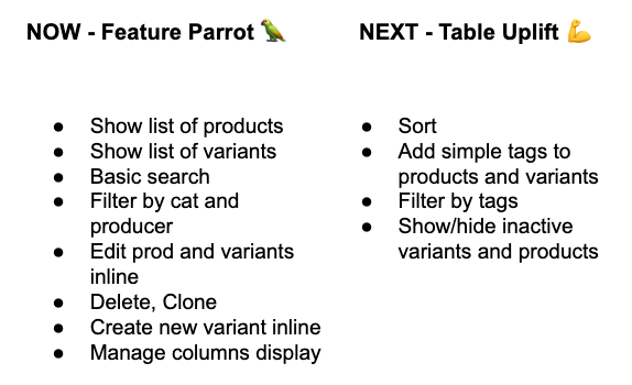
In a nutshell, we would start by building exactly the same functionality as it is now (feature parity column), and then move into some small enhancements (uplift column).

Screen Shot 2020-10-20 at 9.03.25 am

In the next posts I will start sharing prototypes and explanation videos of the new user interface functionality.

Feel free to share your thoughts here :slight_smile:


Connected wishlist and discovery discussions

1 Like

This is the first of a series of explanatory posts to present and get feedback on the proposed designs for the Backoffice UI uplift.
The goal for these posts is to share the current thinking and receive inputs for further assessment and refinement before we commit to a solution that gets prioritized in product curation and built as part of the delivery pipeline.

:pray: Every question, comment and recommendation is welcome, and highly valued. You can also reach out directly over the slack project channel - #backoffice-ui-uplift

How to use the prototypes

  • prototypes are not working software, but a series of images stitched together. Don’t worry, there’s nothing to break in there

  • they are not fully functional. Only certain areas are clickable, you can see a blue visual hint that indicates that you can interact with that area

  • you can also follow through by watching the video and use the prototype at the same time

1. Producer - create first product

  • Landing experience for a new producer opening the product section of the backoffice
  • Creating the first product (no changes)
  • Viewing the product list table for the first time

:point_right:t2: :point_right:t2: :point_right:t2: PLAY WITH PROTOTYPE

Thank you :green_heart:

1 Like

Hi all, a couple of new short videos and prototypes, feedback here and in slack (channel #backoffice-ui-uplift) is appreciated!

2. Producer - columns selection and table scrolling

  • Selecting columns
  • Scrolling laterally when many columns are visible
  • Scrolling vertically

:point_right:t2::point_right:t2::point_right:t2: PLAY WITH THE PROTOTYPE

3. Producer - Edit fields inline and add tags

  • Edit unit
  • Edit stock
  • Add tags to product
  • Add tags to variant

:point_right:t2::point_right:t2::point_right:t2: PLAY WITH THE PROTOTYPE

1 Like

Last video in this initial series of proposed changes. I guess this might be interesting for you @tschumilas :slight_smile:

4. Producer - Filter by categories and tags, sort

  • Filter by category
  • Filter by tags
  • Tag filter rules
  • Sort by stock level

:point_right:t2::point_right:t2::point_right:t2: PLAY WITH THE PROTOTYPE

Thank you so much @Mario for all these info :heart_eyes: . It’s amazing to see all the work coming together in a first step!

I have a few questions, and I’m really sorry if this was explained somewhere and I didn’t see or understand it :

  • Will inventory tags keep working in parallel or will this be introduced to users who are not using inventory first?

  • I’m not seeing any mention of product stock info vs variant stock info in the table uplift summary. Yet in the prototype I see some product like the lentills that have product stock info. Is that part of the uplift scope?

I mean : is the 16 just an addition for information purpose or does it do something else?

  • May I ask you to add in the prototype an example product with on demand stock info? I’m not sure I see how to do it :see_no_evil:

  • For items, unit display names is not shown in the prototype. Is this done on purpose?

  • As this page will be done from scratch, are we talking the chance to do something responsive right away or it’s too much work for a v1?

And some visual comments that are very personal:

  • I like that the table uses more width space, but I wonder how it works on large screens. Price and stock info are the data that are the most used / changed, so they would end up on the left side of a big screen, which sound weird to me but maybe because I’m righ-handed :slight_smile:

  • The category stays at the same place as now, but this place is too visible I think. I would expect it to be closer to the name of the product. But again, this is a very personal opinion.

Thanks Rachel for the feedback and questions. Here’s some inputs on those.

Will inventory tags keep working in parallel or will this be introduced to users who are not using inventory first?
Some time back we started dicussing this with @luisramos0 and @Kirsten, but we haven’t really come to a conclusion on the architecture behind tags in product list. It definitely needs some tech input before we finalise if and how it overlaps with tags used in other parts of the backoffice.

I’m not seeing any mention of product stock info vs variant stock info in the table uplift summary.
My assumption has always been that the product stock value is the sum of all of its variants’ stocks, so I kept it as is. If that’s not the case, or if there’s anything that has room for improvement there, more than happy to update.

May I ask you to add in the prototype an example product with on demand stock info? I’m not sure I see how to do it
There’s no option in the prototype to change that. I’ve created a very simple prototype here to illustrate the behaviour (see lemons). It might need a bit of tweaking in terms of field size.

For items, unit display names is not shown in the prototype. Is this done on purpose?
At this stage I left it open for further exploration. I might be wrong, but it feels like a field that you would not change as frequently as others, so it might not need to add visual noise in the table. I hope that once we get analytics data for the backoffice this assumption can be confirmed or proven wrong. As a discussion point, I’ve included in the prototype in the previous point an option to see it - again on the lemons (it needs more UI treatment, it’s more for conversational purposes at this point).

As this page will be done from scratch, are we talking the chance to do something responsive right away or it’s too much work for a v1?
As I was progressing with the design, I also just started to look at some responsive options, but shortly realised that it didn’t feel right. Trying to squeeze the whole enterprise software into a small screen could be a massive effort, and I’m wondering how much value it would add. I would love to do a bit more research on this before committing to mobile responsive. Some questions that I have on this are

  • Which mobile devices are mostly used at the moment?
  • Who is trying to access on mobile (more producers or hub managers)? For which purpose?
  • What would be the most valuable actions to be performed on mobile?
  • As @Erioldoesdesign pointed out recently - how do we support slow/no connection on mobile to avoid losing progress on editing?
  • Could this overlap with some API work? aka enabling other more mobile friendly apps to access the data

I would LOVE to tackle mobile as well, but I’m thinking that it might need a separate discovery/inception.

I like that the table uses more width space, but I wonder how it works on large screens. Price and stock info are the data that are the most used / changed, so they would end up on the left side of a big screen
I think once we get closer to dev we can start working through the contraints of this approach. We could set max width for both the table and each column as well, or apply rules that don’t stretch the table unless necessary…probably something that can be defined better in design / dev pairing during delivery.

The category stays at the same place as now, but this place is too visible I think. I would expect it to be closer to the name of the product. But again, this is a very personal opinion.
I don’t really have a strong opinion on this, so keen to hear others’ thoughts on it and happy to update.

Cheers!

1 Like

I think there are some tech decisions here that we should look at as part of the inception phase. The way we approach this will affect any later decisions about updating the whole admin UI, which involves:

  • a) moving to a new CSS framework for the admin UI
  • b) replacing our existing Angular code with React

So even though this Product Uplift project is a small and isolated piece, it’s really the template for a much wider set of changes that have a large scope and impact.

The React part is pretty well decided, and I think we can easily slot in some nice React components into the existing structure for this new page.

The CSS framework is the bit that I think needs looking at here, and the decision will have consequences for years to come.

To quote @Mario from the admin UI discussion:

I’m personally a fan of using frameworks over reinventing the wheel

I had a play around with switching CSS framework in the admin UI a couple of weeks ago, and essentially if we choose a nice framework that already includes styling for a wide range of UI components, we can have:

  • very clean views, with a lot less custom classes and layout hacks
  • almost no CSS to maintain (the framework itself will do the styling)
  • the ability for non-FE devs to make beautiful UIs with minimal effort

If we make good choices here we can radically reduce the amount of dev work required in the short-mid term and the amount of code we will need to maintain in the long term.

3 Likes

Jon Leighton previously suggested tabler, and it looks like they are about to put out a major new release which includes built-in support for responsive tables that work on mobile.

So for some of these questions like “can we start to make it responsive on mobile at the same time?”, the answer is: it depends what choices we make about CSS frameworks.

So for example; if we choose something that doesn’t have great support for tables in mobile, create lots of new UI elements, then 6 months later decide we really want mobile-friendly tables, we might have to re-do a large amount of work.

This is another reason I think we should avoid the CSS-in-JS pattern which crops up fairly often in the React world, as our React components would be so tightly coupled with specific CSS styles that we would not be able to easily change one without changing the other. Maybe I’m just being a reactionary luddite on this last point, but it seems like a bad idea to me…

1 Like

With the Material UI library, there are some features that are free and some that are only available in a paid version with a complex and restrictive license, and it’s not clear which features we would want to use? The DataGrid features are split in this way between free and paid. https://material-ui.com/store/items/material-ui-x/

Hi @Mario - sorry I just haven’t gotten to really dig into this yet. At this point - I just have a preliminary question - that is similar (I think) to what @Rachel is asking. I don’t understand what - if anything different - we are proposing for the ‘display as’ field, when ‘item’ (versus weight/volume) is selected. I don’t think the assumption that it is infrequently changed is fair. Or maybe I don’t understand what you mean. I know that our producers almost always use ‘item’ unit types, and thus almost always enter something into ‘display as’. So - maybe other instances are different - but for OFN Canada - this is frequently used. And the reason I’m mentioning it - is that is is also the most frequently messed up part of product entry in my view.

1 Like

I think this decision of whether to use or avoid the css-in-js pattern is really critical.

As a bit of background, if we decide to go down that road; anyone that wanted to change some simple CSS styles would have to read this document and understand it all before they could make any CSS changes: https://material-ui.com/customization/components/

And that applies to both our current dev team and any potential first-time contributors…

Lots of other thoughts generally but just picking up on the Material UI one.

I’m definitely not shy when I talk about my nervousness and aversion to strict component frameworks in complex systems. Even when we used a component framework for a simple app in my last place we found ourselves constantly creating custom components or designing poor quality experiences with ‘lego blocks’ components. We just couldn’t make the right UI for the UX and ended up devving loads of new custom components.

Always happy to talk through this but I would see a utility based framework working better for us.

A few changes have been made to the design prototypes but nothing huge. Mostly tweaking, clarifying and finessing the UI based off some of the feedback already gathered here.

Just giving an update re. collection of community feedback has been covered over Nov and Dec and there’s a few final conversation I want to have with Kirsten as to how we clearly communicate what is in phase 1 and what is not and some key aspects of product list management that don’t have mock ups.

ok cool, how / where /when should we do this @Erioldoesdesign ?

1 Like

See the ongoing notes on discussions here (in Notion)

Just a brief summary to update the community folks that gave feedback on the UI uplift Phase 1 mockups (via Figma).

Here’s what we changed based on feedback

  • We added some hint text into the tag creation ‘pop up’.
  • Multiple shops/producers mock-up was done.
  • Filtering by producer mock-up done.
  • We changed the background colour of the table cells to all white.
  • We started to remove CAPS text for links and any text for accessibility reasons but kept it on the ‘ACTIONS’ button.
  • Added the visual Bulk label into a product that you see on the shop front so users in the back office can also easily see when a product has ‘group buy’ enabled.
  • Global action button and delete function popup. We now have a checkbox system where you can currently only do multi-select and then a global delete.
  • Clone individual product parent mock-up.
  • Add tax category and inherit property back into columns drop down and table.
  • Confirmed pagination style is the same.
  • Changing the weight unit and the effect on variants.
  • The way you change the number of a unit and how that unit’s name is displayed in the shop front has changed slightly to accommodate complexities around ‘item’ and the new in-progress unit price feature
  • Unit price column and table view included

The Figma design prototypes now just move from full page to full page when you click anywhere on the page prototype.

Here’s what was mentioned or requested that is out of scope for Phase 1

  • Do tags work with the existing tags databases (in OC’s, Customer lists etc.) Not for this phase but the intention is to have a unified tagging system across any areas in the back office that can benefit from tagging
  • Bulk applying tags and more bulk actions are generally helpful and wanted including clone and edits.
  • The process for selecting multiple products (parent products and variants) and then doing ‘deeper edits’ on the product edit pages in a sequence was discussed.
  • Being able to re-order products in the visualised list either through arrow clicks or drag drop. You can filter well in the UI uplift but many back-office users want to reorder and ‘categorise’ their products and have that reflect how they display in the shop front list order.
  • The effects on CSV uploads
  • The effects on reports
  • What elements from the deeper edit product pages would be more useful in the table view e.g. product description

There were other comments and ideas for future phases and also a discussion on how this gets implemented from a front end development technology view is part of the next steps in phase 1 :slight_smile:

Thank you all for your patience on this one! there was amazing work done by Mario and then the process of gathering the community feedback and implementing it was rather new (especially to me as still relatively new OFN staff member!)

The main thing to know if that this is only phase 1 of a bigger Network improvement project for the back office there will be time to be part of this process and project still!

1 Like

Thanks @Erioldoesdesign this is really exciting :heart_eyes:

I have one main concern around tags. I’m deeply sorry if I’ve missed this in the notes somewhere but if I understand correctly we are introducing them in the UI, yet they won’t have any impacts on other features. I think this will confuse the user and increase questions towards support teams.
I would prefer if we remove them from the scope of this first phase. ping @Kirsten what are your thoughts on this?

ping @Cecilia-Hn important topic to follow from now on :wink:

What does it mean? That users with UI uplift activated won’t be able to import csv anymore? Or just that we are not introducing tags in csv?

No worries @Rachel there’s a lot in this project so it’s easily missed.
So this product list tags UI won’t be connected to other tags for the first phase but it is intended to be. I think it’s a @Kirstenand possibly a @Jana question to see when it could be. Likely they both will need to chat with devs to find out how tricky that would be.

I agree, having multiple tag systems in one product that don’t ‘talk to each other’ is confusing. This is why a unified tags system coming up very closely after the phase one (or in phase 1) is very important.

Re. CSV - no changes to CSV upload is included in phase 1, which mostly includes the new ‘tags’ section

I agree about the tags, but also urge caution about how soon the unified tag system will be - will that be higher priority than adding my own variant of someone else’s product? not for me . .

I wonder if we could slightly alleviate this by calling them something different for now? What if we called them ‘Labels’ - then there is less of a suggestion that they do the same things as tags elsewhere? Once we do make them do the same thing, we can rename them tags?

Might be a really bad idea

Why not, but I’m not sure I understand why people would start using them? What is happening when I create a tag/label in this view?