The OFN map is confusing for users. Map icons are green and red, though the meaning of these colours is not well communicated and generally not well understood even by OFN core contributors. The assumption by new users is that Red icons mean closed and Green mean open. This makes it look like OFN is full of closed shops, which does not look good.
There are ongoing discussions about completely designing the OFN map, which is a much bigger task requiring a lot of design. This issue is a quick win to reduce the confusion.
Animated Gif/Screenshot
Context
Many new users to OFN ask why the map icons are two different colours and ask why so many shops on OFN are closed. They ask what is wrong with the software if there are a lot of users that don’t use the platform. And they ask why their own shops appear closed when they are open. This is an annoying question for administrators and onboarders to have to answer all the time.
Cool I understand that the need is for visitors and potential hub to clearly understand what the actors on the map represent.
I also undestand the confusion with current red / green / white colors.
I guess there could be various solution to improve visitor readability:
add a legend would be one
make all icons green is another one
make all icons white (neutral)
choose other colors than green and red but that enable to distinguish suppliers from actual sellers would be another one. Like yellow, blue and white.
I feel a little bit annoyed still by the fact that on shop page icons appear in red. Isn’t there a discrepency ? In the case the “make all icons white” would be the less confusing…
Add a legend - It will be an interesting task to write in 3-4 words what the colours even mean.
Make all icons one colour - great, sounds good to me. Red, green are the least work as the icons exist in these colours. Any other colour is more work to make the new icons.
Add a more complex colour scheme - this sounds to me like there is some serious UX consideration to be made in what the map is offering to the users. I would think this is a big inception task and requires user conversations to understand the value in the map.
Moreover, AFAIK as we have multiple package types, some markers show the producer/hub icon but a color different than others, so it’s impossible to tell what’s the difference. When people ask me, I just tell them to check the icon. Either tractor or pin. Having a single color would remove confusion but not value IMO.
But some producers are sellers and other aren’t. As a customer if I look for a shop, I want to see the icons of the hub who sell around me, no? I will not think to check the tractor profile maybe because I don’t know if they have a shop or not…
If we put all the icons the same color, it will be hard to differentiate those who sell from those who don’t, no ?
In your example @lin_d_hop all the producers are setup as sellers but have no active shops for most of them, shouldn’t they switch package if they don’t sell on OFN ?
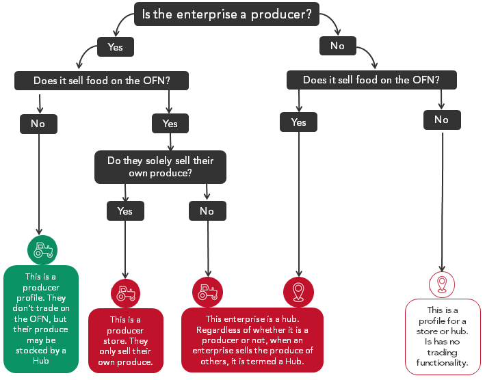
The way I explain current colors is:
all what is red means they sells on OFN.
all the tractors are producers, as you see the red one sells, the green ones supply hubs but don’t sell directly through OFN
white icons are hubs who sell but not through an OFN shop
I have no data today to tell how people use the map feature. I have no objection to switch all dots to a single green color but then I think we need at least a small filter to see the sellers so customers can find all stores, regardless if they are farmer run or not.
My point is that AFAIK we don’t seem to successfully communicate that to users. It’s not even clear for me due to the number of combinations. I think a filter would communicate much more to the user.
Here is the diagram that communicates it https://www.openfoodnetwork.no/shops/signup (a bit down the page).
I see this is removed from all the other sites (FR, UK, AU, KA), don’t know why. It’s well hidden though, so no one only looking at the map will find it.
But the different colors, icons and combinations are overly complicated and should be able to refine.
I copy the diagram here:
@MyriamBoure The current package system doesn’t work at all with the current UK usage / payment plans and thus we dont spend any time communicating it to users. And since the point of OFN to us is not currently a directory (as the directory is very limited in its feature set) the profile only option comes up rarely for people who find OFN and set up but dont use it. Thus we have very few greens but even one green confuses everyone.
We obviously have lots of work to do on the map to make it work for any instance well. But this issue is not trying to explore ‘Making the map/directory work’. It is simply trying to propose that we find the simplest solution for making it less confusing while we prioritise our directory features.
As UK has many many closed shopfronts we’d benefit from a filter feature. But even scoping that is a bigger task and would take some dedicated time. I’d be very happy to open a separate wishlist item for that.
Making all icons the same colour is only intended to be an interim solution. It would be great if anyone interested could upvote this tiny adjustment. In the simplest form we really could make it a ‘Good First Issue’ and spend our time contemplating 2 more fundamental issues:
Adding better map filtering so that the map works for OFN users
Improving the API such that we have a fully featured directory capacity
I understand but it is annoying for France as we use the map a lot to introduce people to OFN and explain the red dots are places you can buy from, the green supply those red dots, etc. It is very useful IMO as it makes our ecosystem visible and we DO use it… I see that as a regression on one hand, even though I agree the colors are confusing. So it seems certain instances do build some onboarding strategies using this differentiation, which you don’t in UK and I understand it…
If all the dots was the same color, we could try to present differently, say that all producers are tractors and all “hub spots” are hubs not driven by farmer, but that some of the tractors dots may have shops attached to them… it’s a bit less clear, but if France is the only instance to use that differentiation maybe we can cope with it if it’s important for others… what do you think @Rachel ? I’m a bit torn… one part of it is regression but removing color confusion is an improvement…
And yes @sigmundpetersen I don’t know why it disappeared it was on France instance, I did translate it, probably got erased when we switched server, I need to check.
@MyriamBoure Cool well if you think your users actually do use this feature after you communicate it to them then for sure we should keep it.
I’d be very interested to know how people actually do use it. We know in the UK, for example, there are a lot of things we tell people about that they never ever use. This will be very crucial information for the actually directory redesign, when we get to that feature.
The only thing I can add is that so far people have written to us saying they don’t understand why the shops are always closed. Even if the story you communicate @MyriamBoure is important, in terms of UX we should focus on how people understand by themselves and not how we tell them too, especially for one of the main public pages.
So my understanding is that people want to know which shops are open as a first read. Afterwards, they dig for more info. If the shop is open then it means it is selling something, so it works with your approach as well @MyriamBoure isn’t it ?
And of course first of all the map should have a clear key (legend) explaining colors and icons. And then we can debate on the colors. IMO green and red are very confusing and also non inclusive for colorblind people (for whom the map is already with one color). So whatever works except red and green ?
@Rachel My fear with a legend is that we’ll end up creating problems with embedding and with mobile and still the communication of the different complicated colour/icon meanings will not be very clear.
It sounds like we now have two possible quick fixes:
Make all icons one colour and handle the small regression for now.
Make a legend that provides a clear communication of the 4 icon types for now
Note all solutions are temporary until we prioritise putting design into the map for OFN users, which itself is a separate priority to making a good directory.
my random contribution to the discussion: what if we just switch red/green colours???
you still get the value (differentiate between selling on ofn or not) and no one will ever think a green icon means shop closed
Yes BUT, does an “open” shop means they have an active OC ? Shouldn’t we present as active Micromarché for instance who is open 3 days a week ? I think we want to orient people to active hubs, regardless they are open at the moment or not. And we should assume that all sellers on the platform are active, I know it is not true but it will be our job to clean IMO.
So I think we should identify “vendors” in a color that doesn’t suggest that they might be closed
So let’s add Luis suggestion, we have:
Make all icons one colour and handle the small regression for now.
Make a legend that provides a clear communication of the 4 icon types for now
Switch green for red and red for green, so non-vendors producers will be red, vendors producers and distributors will be green
I would add : non-vendors producers will be white (like current white distributors not using OFN, so the color already exists), and vendors producers and distributors will be green. So we would have all OFN vendors in green, and all others in white. Doesn’t suggest that shops are closed, and distinguish / attract eye to vendors on the platform. No need for legend.
What is your preferred option @lin_d_hop@Rachel@luisramos0 ?
Mine is 4 Let’s see if we reach a consensus, else we will try a consent
I don’t understand how switching green for red and ref for green is going to improve the closed/opened feeling…
Also why limiting the map key to option 2? To me it should be there for all options: we always need a legend. I’ve literally understood with this thread what the white color was for. Before if someone would have asked me I wouldn’t even know it. If we are afraid of technical complexity, it can be present on the page as a simple text outside the map, what do you think?
I would then vote for option 4 BUT with a map key.
By the way how many profile-only accounts do we have per instance? Is it really used?

 I understand that the need is for visitors and potential hub to clearly understand what the actors on the map represent.