Users are not able to identify easily who the orders belong to, which customer did order, as only the email info appears on the order line. Sometimes that email is pretty generic like “awesomepeople[a]something[dot]com”. So when they need to capture payments for multiple customers at once, it’s hard to do it, they have to search customer one by one, they can’t see at a glance and just capture action.
1- @Rachel suggested to try to remove a column and replace it by the first + family name column.
2- @sstead suggested to do like for products and order cycle, add a “columns” button to give the possibility to show or hide some columns.
After looking again at the table, I don’t see any info that could be removed from the table, they all seems pretty essential as “quick view” to understant at first sight the status and search for orders. Only the first and second name are missing, so I would be in favor of option 2.
Side comment on process: It’s a pretty “quick win” so it would be great in our attempt to work together on priorizing things to test our new process candidate on it : 1- We had a wishlist (previous post) we see something more concrete with options and inception starting so that moves to icebox draft while inception are going on, when inception is finished and we have a clear feature candidate identify, we put it in the feature backlog as ready to prioritize and when prioritize enter the dev pipeline so moves to github.
Ping @danielle@Kirsten
We had again another user giving the same feedback hard to identify the customer behind an order. We had another go with Rachel about another option which would be to limit as much as possible the info in the quick view, and then enable in one click to get more info depending on the need, like:
I need the customer email or phone, I click on his name and that display (or open in blank) the customer details.
I need the detail of the order, I click on the order number (as it is now).
The notion of “complete” doesn’t seem useful as only complete orders are displayed usually, and there is a filter to tell if you want to display only complete orders or other, and you can filter by status as well. So it might not be necessary to have it in the quick view.
Probably just the info about the total amount of the order and if it is paid or not is sufficient.
The date could be displayed 2018.22.01 for instance instead of full text and save space.
The distributor could be a filter
Anyway so we could work a bit more the option 1 as it seems some columns could be removed from the quick view and info could be displayed on click in the detail of the order for instance.
At least to start with we could only remove the customer email and replace by First FAMILY name. Filter would still be possible by email of course. It would not increase the size of the table (that might become then unreadable).
This latest suggestion is very interesting. I don’t like the option 1 of keep piling up complexity as if it was free. If we had data about its usage, we could consider if it’s worth having it or not.
Aligned with your comment @MyriamBoure, I also like rich tooltips like the one below
to display that extra information because the avoid me having to navigate to a new page. However, this sort of UX fits better in a 2nd iteration IMO. It won’t straightforward with our frontend.
Rich tooltips, that’s awesome ! If we could display customer email and phone number when your mouse go over customer name, that would be sooooo cool ! Is it technically easy @sauloperez ?
You say you don’t like option 1, I guess you meant you don’t like option 2, right?
So given latest comments, my proposal as a first feature candidate to answer the user needs is: replace email column with First name FAMILY NAME in that column. @sstead@tschumilas@SineadOFNUK@sauloperez@Theodore@Rachel would you agree?
Then we will see in later iteration to improve the view of that page.
tooltips i believe don’t work on mobile or are hard / bad?
I think the best solution would be the optional columns
don’t have strong opinions about which fields are most important - but also don’t believe we have user information to know what people think, so we could really annoy people by changing it around and making them select columns everytime when previously they didn’t have to
For my 2c, when i was intensive user of the system I got to know the emails very quickly and knew exactly who everyone was
Can still search by name i think if you need to
I am also not sure whether this is ‘quick fix’. I don’t understand what makes something quick fix when we are so constrained in getting things done. If this took half a day (I suspect more) and then had to get through the pipe etc - would it be more important than that half day on outstanding subs issues for example?
I would love Yuko’s input on this @Kirsten. @Rachel UX view is that is a bad practice.
You said “you got to learn users email” but was it really the most practical and user friendly thing? Or did you got to learn them because… you had no choice
We need to stop pilling up and just adding, we need to clean as well.
I won’t object to add an option column if that’s what everyone want, it would solve our users problem which is the most important for me, and happy to have a dev view. @sauloperez as you answered on this post, what would you say as Tshirt size for:
1- Remove email column and add a column that aggregates First name and FAMILY NAME ?
2- Add the button to select option column and make the column “Name” (aggregating first and family name) as one of the options to select and display?
I don’t know, I just don’t like the optional columns solution. I feel like when in doubt and because we have no data, we tend to throw in complexity, just in case and assuming it has little cost.
You said “you got to learn users email” but was it really the most practical and user friendly thing? Or did you got to learn them because… you had no choice
so true! we get used to things that can for sure be done better.
what would you say as Tshirt size for:
1- Remove email column and add a column that aggregates First name and FAMILY NAME ?
2- Add the button to select option column and make the column “Name” (aggregating first and family name) as one of the options to select and display?
1- S
2- M
But that is just my opinion. Essentially, 2 is implementing 1 + extras.
Just to be more precise: my position is we need more info to go forward.
To clearly give an opinion, I’m missing 2 things and my guess is Yuko will need them as well:
We need a clear position whether we want one day the backoffice to be responsive or not. Letting customers choose which columns to display would end up sometimes with all columns to be displayed and to something that is not responsive at all / ugly. If our strategy is to say the admin side will remain desktop only (and a specific app will tackle mobile needs), then yes we can explore both option. Otherwise option 2 will need a redesign of the page and will not be a quick win.
Also if we say we want it to be responsive one day, there is also a strategic turn to make (or not) in saying let’s design “mobile first” in mind. That way debate on tooltips e.g. are quickly managed as on mobile tooltip = new tab. So with a mobile first strategy we would design a new tab on desktop as well. Again these to me are strategic decisions we need to make before continuing UX discussions. It’s too hard otherwise (at least to me).
We need to ask our users just like you did with François, Myriam. As far as I see Matomo cannot tag a specific column so we need more info on which tab are the most used. Or try something and let them react.
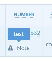
This (along with quick capture of payments) has come up as a major issue for us too. The likelihood of any major project in the short term makes me wonder whether perhaps a tooltip might be manageable if ugly way to actually sort this. We already support a very basic little tooltip in this page with the notes field, which allows hover of some info. I have just checked and it works just fine in mobile
Could we get a very quick win here with an ugly little blue ‘quickview’ with customer name, and maybe the items in the order (the other thing we’ve been asked for - just sneaking it in here . .
@Kirsten not sure we can solve that so easily as there need some “permission” condition here, the hub needs to allow or not the producer to see the customer name (unless we make a survey and all our users are happy for their supplier to see all their customer name, but I doubt it, it is sensitive info not all hubs will allow to share… depending on their model). I know it’s frustrating, we are all frustrated about very important things our users need, we are loosing users also in France because of that… but we have to go through this… nevertheless we could rediscuss priorities for the next things after the most priority ones like performance, etc. Just my opinion maybe others will disagree
In any case, we need to evaluate the value this bring to users and how to metric it. I would also roll this out to a very reduced subset of users, to have a quicker feedback loop so we don’t build something doesn’t provide the expected value.
I don’t think that’s the case @MyriamBoure as the orders page is already managed / scoped to only be seen by the hub. Producers can’t see it at all. That’s a different issue being discussed elsewhere.
This is purely about the UX of this page, and the fact that Hubs can’t actually see whose order is whose without clicking through, which is really annoying. And the fact that we already have a quick/cheap solution to this that we use for some fields like notes, seems like it would almost be a ‘papercut’ to just allow them to click and see customer name in the first instance. Any thoughts @lin_d_hop - could this count as a papercut?
@Kirsten Sounds like:
a) The feature candidate is not well scoped yet
b) We’re hacking a pipe section that doesn’t yet exist - Introduction of Papercuts has not happened and will be discussed in a future meeting.
I think there is a potential feature candidate here with an XS tshirt size and I think given the number of requests we have for this an XS size UX change might well be a papercut. I’m not ruling out your thinking
If we have a bunch of product people sitting around twiddling their thumbs (… really?) I don’t see why we couldn’t scope this and choose our FC? It goes against the design principle of not stating something until we intend to complete it… but it also might just get this long standing HUGE annoyance a step closer. shrugs
Oh yes sorry I got confused with producer viewing the customer name, sorry @Kirsten I mixed the two issues. Agree with @lin_d_hop if the “neat” solution is XS let’s do a neat thing instead of a hard-to-visualize tooltips with customer name… but agree that it’s a need shared by lots of people.
ok. seems we all agree we want to move this forward as it’s really annoying for lots of people. I am happy to do the ‘feature scoping’ - but unsurprisingly I am unclear on what this actually means at the moment. @Rachel@danielle@lin_d_hop@MyriamBoure how’s this
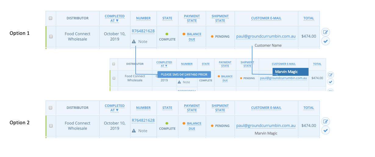
Option 1: On the Orders Page, under the customer email, add a tooltip called ‘Customer Name’ that works the same way as the Note tooltip i.e. hover pops up a field showing Customer “First Name [ ] Last Name”
OR
Option 2: (even better?) if there’s room under the email for the tooltip, then there’s room for the name - why don’t we just print the First Name Last Name under the email and change the name of the column to ‘Customer Contact’