Maybe a short video when a shopper first uses OFN explaining how the search and filter options work. Maybe with an option of “Don’t show me this again”
Yes, offer the choice of two or three shopfronts to hub managers, so that they can choose a GoodEggs style photo base shopfront (or stay to something less photo base, if they don’t take pictures of the products), would be great.
In France we did a tutorial to explain shoppers how to
find their shop
choose their products
finalize their shopping
pay
As less computer oriented people found it difficult to shop… So maybe at the first connection, a step by step journey with pop-up appearing on the site and with a small comments, going through the shopping steps, with a button “next”, to go over the demo, would be great. But we need to make sure it only appears the first time a user shops (with a cookie? I don’t know how that work)
Some users don’t naturally look for the trolley at the top right corner to finalize their order, they go at the bottom of the page and look for a button, which doesn’t not exist (I saw a user doing that, I had to tell him to click on the trolley which symbolize the basket). Maybe add a button/link “checkout” bellow the “update cart” button at the bottom, like it appears when you click on the trolley actually?
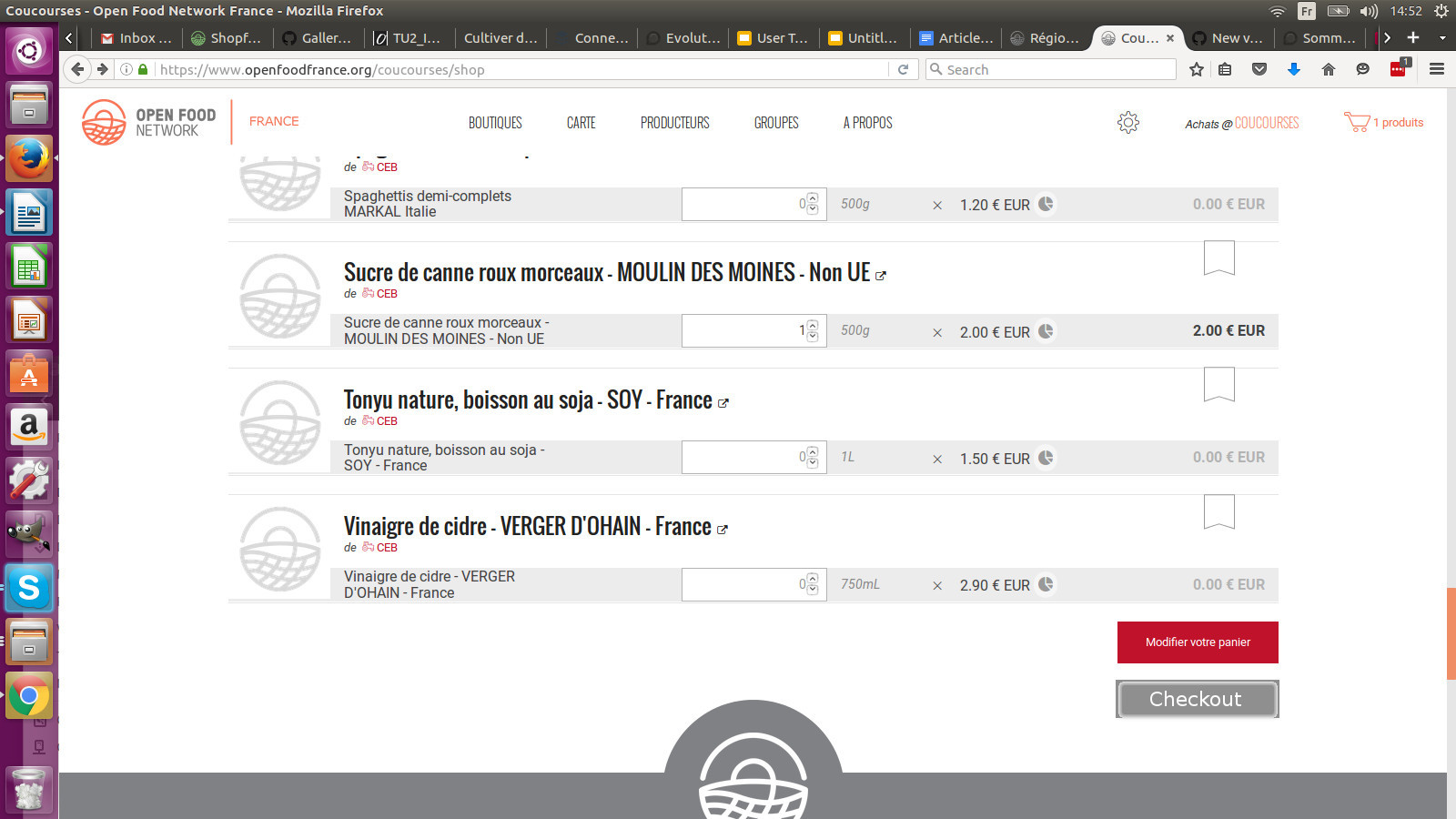
The way product categories are displayed is not so user firendly, you have to click on “more” to see the other category, and it can be frightening to have this looooong list of products on just one page.
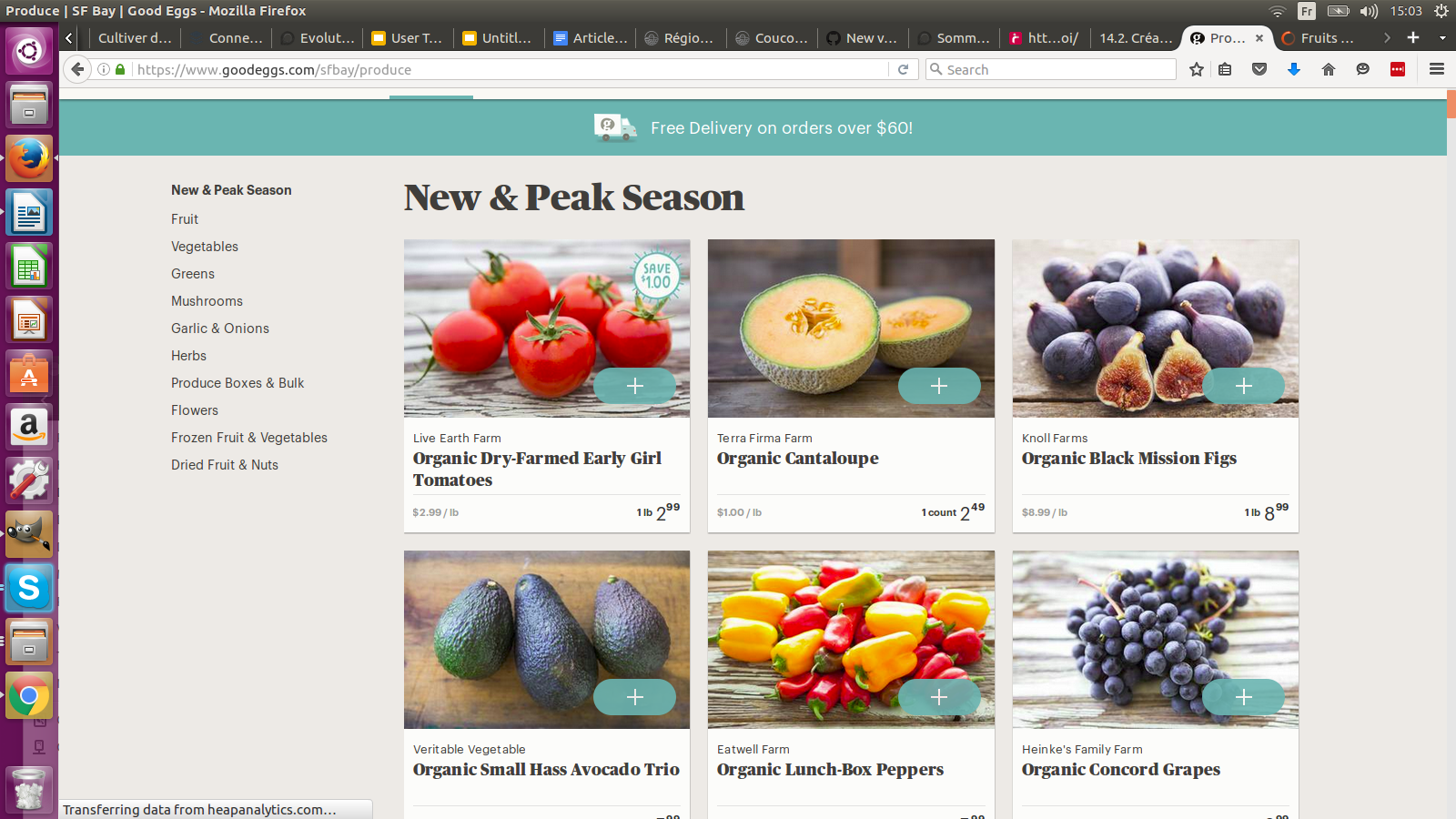
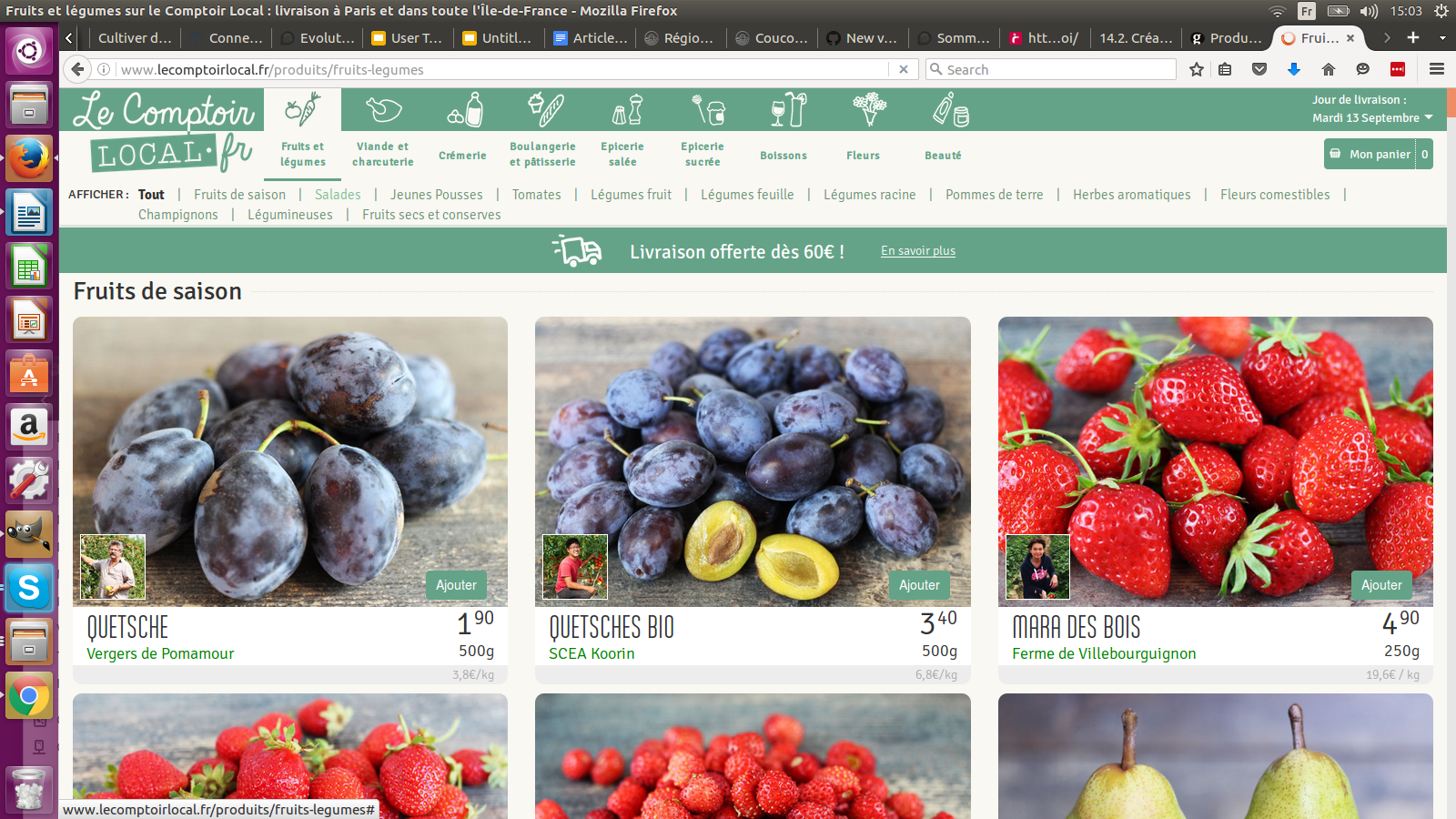
Should we opt for shopfront with a more widespread category menu? Either vertical (Goodeggs style below) or horizontal (comptoirlocal style below). Interesting in Comptoirlocal, they have a two step meny, in “fruits and vegetables”, you have sub-menus (salad, root vegetables, season fruits, etc.)
Today in OFN all menu category are displayed on the same level, and even the title of the category list (usually: products) is proposed in the list when a hub manager add a product. So for the shopper, he can’t see any two step menu. I think that would make the product list more easy to navigate to have the possibilty to have two steps menu, and a way to display the meny that avoid to clic on “more” button to see all the option.
As mentioned by a hub manager regarding his experience with his customers, the shopper doesn’t want to give too many information about himself, especially private informations that doesn’t seem obvioulsy necessary. So we need to enable the hub to decide which info should be compulsory, and not ask as compulsory info what doesn’t need to. Make customer address and phone non compulsory info at checkout?
I have mentioned before that I would like it to be much clearer if a product is labelled “organic” or similar. At the moment you have to click through to the product description and because that’s not good enough, I have added (organic) to each product title, so to make it clearer to shoppers. Much better would be to have the label shown right there in the list of products.
@Oliver I agree, however I am also aware that we are dealing with a wide variety of demographics, many of which don’t find intuitive websites intuitive at all. I think we’ve all had dealings with folks of older generations who just dont find anything on screens intuitive. I am thinking that the popup bubbles or whatever would be mainly to support these groups.
hi people - just a note that it would also be good to be adding to this thread things we like and ideas for how the shopfront could work to be most awesome . . like @MyriamBoure’s post above, so we’re starting to build a picture of what we really want . .
my feeling is that the ideal would be that it is easy to use enough that MOST people don’t need an instructional video, but perhaps that’s there for those that do. It’s certainly common enough on other sites . . but generally not shopping ones. I feel that this might be something applied in the back-end / admin side but we should really try not to need it in the shop / checkout
known problem: when hubs are using ‘distribution methods’ to enable selection of different collection points, the customer cannot see what these are until they get to the checkout. People get around this by listing the distribution points in their ‘about us’ info panel, but this means that a) people need to look somewhere and b) they have to keep info up to date in two places.
Was in the original design (but we ran out of money to build) a place to display and select from distribution methods in the shop itself. This would potentially also affect distribution cost, which would mean customer sees the total order price in the cart on the shop page, rather than finding out at the next step that there’s an additional cost
Would like to see this integrated properly in shopfront 2.0
question: price transparency modal / pop-ups . . how much / well are these being used? would it be worth putting some analytics on them to know if people are actually accessing this information? could this mechanism be used to deal with some of the VAT display issues? i.e. change the colour of the icon if VAT is included in the price, and show the info in the modal
It would be also useful if you could tag certain items to a distribution point, and people selected the point before they shopped so they only saw products that were available at that specific pick up. For example, if some collection points had freezers and were able to sell frozen stuff, but others didn’t.