just having a little look at where some others are up to, farmdrop is pretty nice n easy to use
https://www.farmdrop.com/london#Uub6pDK5ewxzjHob.97
Interestingly I had a discussion yesterday with a hub manager who said what he liked in OFN was the simple appearance of the shop. For activists group, they really don’t WANT fancy pictures, for which they would need to take beautiful pictures, they just want a clear list and transparency. So I think it’s important that if we have more picture oriented version of the shopfront appearance, we should have various options for the hub manager of how the shopfront will look like.
Or we could have View options in the shopfront so the user can choose e.g.:
- List with no pictures and minimal info
- List with pictures and more info
- Tiles with info below
The hub should also be able to choose default view from backend.
I was demonstrating OFN yesterday in a trade show in Toronto - primarily to consumers. The feature they liked the most was the price transparency graph. Next they linked that you can click on the producer name and open the about them description. I was only demonstrating a simple hub with few products, but even so, people didn’t like scrolling through a long list. And - they thought the quality attributes/certifications about the products were not clearly enough stated. Finally, they didn’t like that a fee was added in at the end when they checked out. They expected that applicable taxes would be added at the end, but they wanted to know about any other fees up front. I had a distribution site with a fee that added in at checkout set up in the demo - and they wondered why this fee didn’t appear in the price transparency graph in the shop. It would be great to address these - although, I’m in awe at OFN as it currently stands - I’m blown away by how we want to do even better. I also want to add a comment on taxes and where they should be displayed. For me, it makes sense that taxes are displayed at checkout. All the other fees (mark-ups, fundraising, distribution…) are all fees ‘internal’ to a food network, so it makes sense these are all on the transparency graph. But taxes are not something we (producers, users, admins…) decide - and this money is outside of the food network. So I’d keep the graph only for costs that are ‘internal’ to the food network.
I think the ability to show taxes on shopfront or at checkout is definitely a feature that is required by lots of people @tschumilas. Normally all the other fees can already be added upfront, it depends on how you set up your hub  Only the payment fee, if you set it up, will add up when they choose the payment system. But you can also treat that as a regular entreprise fee and add 2 or 3% in the product price to cover the payment gateway cost, if you want, so no fee at all is added at checkout.
@MyriamBoure We recently tried moving around how we charged our fees on cycles, to try and have all the calculations correct (specifically the payment gateway fee), and were surprised by what our customers had to say about it.
Originally we had put 2.5% to cover payment costs in as an enterprise fee under ‘sales’, but this number only calculates a percentage of the producers cost of the item, it does not cover the cost of the payment gateway on the other enterprise fees. We also wanted to include the cost of using the platform (2% in Norway) but that too needs to be calculated against the enterprise fees as well. Right now, the only way to do that means showing the customer a additional cost at checkout (both for delivery and payment fees where applicable.) In Norway, customers are used to having all fees included in the item cost (except delivery fees). We had instant feedback that our customers did not want to be charged a new (payment) fee at checkout, and many decided to cancel their order and write us instead.
If it were possible for customers to choose their pickup/delivery option first and payment method (ideally having a default one stored against their profile) It would be potentially possible to have all the fees calculated in advance.
@tschumilas as a Canadian, I have always been used to having taxes applied at the end, I was surprised when I first moved here about how all taxes are included in prices here. It will be interesting to see how we move forward to enable the platform to manage the various needs of different societies and cultures.
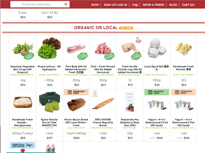
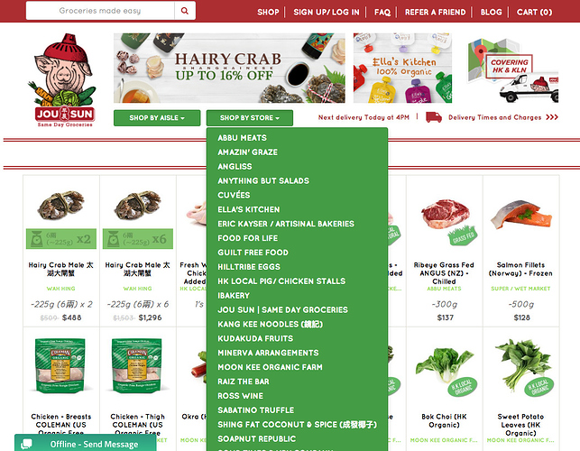
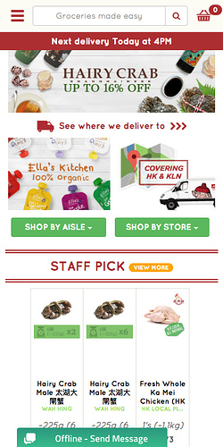
just having a look at the price of organic food in hong kong, as you do, and found this website which is really interesting in terms of ease of use and the ‘shop by aisle’ and ‘shop by store’ options. also the ‘only available monday’ labels . . they’re doing something interestingly akin to openfoodnetwork here i think (except that they’re warehousing and handling on behalf, so i guess more like a big single hub) . . and it’s incredibly easy to navigate
responsive also not bad, although haven’t tried actually putting an order in
I think that the user should be the only one able to choose the shopfront he wants. We want consistency on the user’s end, therefore it’s a big risk to let hubs choose the default view. For shops with no picture or with poor quality, OFN could offer defaults from simple flat design samples or copyright-free pics !
another one I just came across that might be useful to look at for ideas
http://link.thrivemarket.com/view/58625787e661f00f2d8b7e075875143ae661f0c4628b45f9/bd63cab4
Hi everyone,
Just doing some thinking / planning for priority projects in 2017 and getting my head around where this is up to, could anyone provide a high-level summary for me? @lin_d_hop @danielle @sstead? I can just talk to Danni about this when she’s back, but I need to get something to Germany today or tomorrow so any hints appreciated!!
- Has a big picture customer flow re-design happened or Yuko was focused on the immediate pain points, which have now been turned into issues for working on?
- Has there been an estimate of the size / cost of doing the issues that are in github?
- Is there still a need / desire for a bigger picture shopping experience re-design?
Sorry i’m not across this, better answered by @lin_d_hop or @danielle
Hello All,
This blog post by folks at uncommon.is is a nice read on how they go through the whole process of design of UI. Their rest of the blogs is also a welcome read when it comes to design !!
I am trying to get in touch with their team here in Bangalore, India and see if they would like to contribute to the OFN project. They work with many heavily funded startups locally in India, so not sure, but will get back on that.
Related to UX - but also perhaps other issues - https://my.basqet.co/market Neat idea I was just discussing with some farmers’ market managers in Toronto. This company forms groups of buyers (circles) in suburbs outside of Toronto primarily, then makes an on-line market that lists products from Toronto organic farmers markets . Then the customers buy from the farmers’ market and he does their ‘shopping’ and delivers to their circle (drop spot). I like his product display.
(We talked about how OFN can be used to do something similar. For example - a market manager could move the terrestrial market on-line, and then the market becomes the ‘drop spot’ - so a way for farmers at the market to do advance sales.)
Maybe add a button/link “checkout” bellow the “update cart” button at the bottom, like it appears when you click on the trolley actually?
An Aus user has also complained that shoppers get ‘click fatigue’ going through the ‘edit cart’ page and suggests we emphasise going straight to checkout, rather than taking them to Edit cart by default. I think Myriam’s suggestion above would also be a good easy fix to this.
Anyone agree/disagree?
Sure I agree @sstead  It could be a good first feature candidate to improve shopping ux, it’s pretty simple I guess. Hopefully we can prioritize some UX work sometime soon…
Just making a note, our user suggested also making the cart appear more like a button. Currently it may not be obvious that it’s clickable. He did a mock up for us…

New large hub user here has zoomed in on questions about changing the shopfront (loves the backend - but wants to see options for product display). AND - even after spending some time in the shopfront, she didn’t pick up on filtering by properties. Those properties listed top right just didn’t grab her attention. She was looking for a ‘menu’ either along the left, or make the properties more obvious. I think its a colour thing - the colours on the cart and properties seem to fade into the background more than we want. With larger shops (this one has (400 products and we are still building it) we really need obvious strategies to organize products.
Second - she really thinks the pie chart is a ‘waste of space’ on the screen. I know I’ve said how much I like this in the past - but I’m re-thinking that. How many users even take the time with the pie chart when there are hundreds of products they are scrolling through? It would be more important that as they hover over a product picture, an image of the farmers/producers pops up - or something that emphasizes our transparency.
I really want to to dig into some shopfront stuff soon - when will we be there? With our current funder (who is funding spree upgrade and multilingual) satisfied - might I approach them about shopfront? or about mapping? - I think they’d go for something more ‘consumer user’ focused.
I don’t see the pie chart consuming a lot of space on-screen - and I’m a fan of it.
One thing we’ve seen, well, heard, with CLFC is a misconception that the co-op is making a LOT of money on products, and really marking up prices. That little pie chart very clearly shows those buyers just how many pennies (or nickels in Canada) we’re really getting from each sale.
Will EVERY user look at it on every item? Of course not. But it is quite useful for those who want to see it - and it definitely adds to transparency when it comes to what you are paying. It’s a 16 pixel circle, with useful information behind it. That’s far from wasted space, it’s actually incredibly efficient.
I do agree as far as the properties/product categories listed at the upper right. It wasn’t immediately clear to me either that those were filters at all. I thought it was just a list of product categories that were available in the shop. Something that tells shoppers that they can filter the results there could be useful. Whether that’s a dropdown list, checkboxes, or a simple ‘Click to filter results’ instruction with the current setup – which works very nicely once you know what it is – is something the UX experts could decide. The current function is great, it’s just not clear to a new user that it even exists.


