Following on from:
Mobile ready and UX Upgrades and Customer Mobile Experience - #2 by lin_d_hop
I’m putting together an overview of the scope of the mobile shopping improvements work that is currently in development.
The first thing you have to read…
…is the GitHub overarching epic that was created to explain the work to be done: Mobile shopping UX improvements · Issue #4531 · openfoodfoundation/openfoodnetwork · GitHub
This explains things at a high level and gives you all the links to the relevant design overview and stories being done, etc.
NOTE THAT THE CURRENT SCOPE OR SET OF DESIGNS DO NOT INCLUDE EDIT CART OR CHECKOUT.
If this is something we want to do we’ll need to agree that this is a priority and get Yuko to do the designs.
Then you can follow progress of work…
…by watching this project board. As the stories go from green to red you can see the progress being made: Mobile Shopping improvements epics & story map · GitHub
Release plan (as best as I can give you right now)
We’ve broken the changes down into sections, each of which will be built and put into a release as a whole to try and make it easier to a) communicate about changes; b) remove some of the “frankenstein” like feel to the implementation (a new bit stuck in with an old bit etc etc)
1. Shop content tabs
Right now we are working on the shopfront tabs, which you all experienced (somewhat negatively) in the release a couple of weeks ago and can read about here.
The overarching epic for this release talking about problems we’re solving is here: [mobile ux] 3. Shop content tabs · Issue #4567 · openfoodfoundation/openfoodnetwork · GitHub
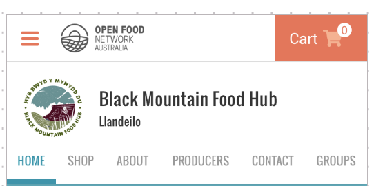
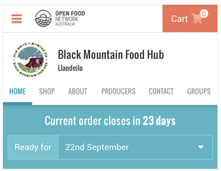
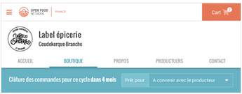
Changes in this release include:
-
 (live) Introducting tabs (instead of a list of expand/collapse sections) for all the different content types on the shop.
 -
 (live) A change to the “shopfront open message” (the a green call out box on the shop) to become a shop home section, which is where the shopfront open message displays. Note that this changes the purpose of the shopfront open message to become a consistent place to talk to shoppers about everything and anything. There is a big opportunity here to extend this section beyond the basic delivery info to include specials, promotions, etc.
- We assume that your users can use the homepage tab for all the detail they had in the shopfront open message, and that this is a better experience for shoppers rather than scrolling down to see products. If your users contact you saying they need an “open” message alongside of the homepage then you need to tell us so we can revisit this decision.
- We should also explore how we’d like this tab to evolve and improve in the coming year.
-
 (live) The shop tab does not show when it’s a private shop; the groups tab does not show when they aren’t in a group; the home tab does not show when they don’t have a shopfront message added.
 -
The fonts and colours are updated so that we have no more WARNING RED as a highlight colour on the shop, we now have the chosen teal blue tabs, grey and black font and orange links.
-
We’ll restyle the shop closed message in the shop tab, and also the private shop message that displays on the home tab.
2. Order cycle display
Next up is the display of the order cycle information. You can read all about the overarching epic and the problems we are solving here: [mobile ux] 4. Order cycle design update · Issue #4572 · openfoodfoundation/openfoodnetwork · GitHub
Changes in this release include:
-
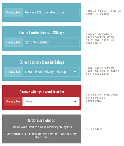
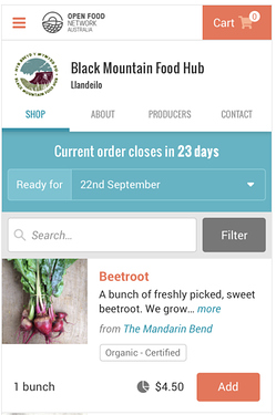
Restyle to look like the above
-
Orders are closed message to display in the same place, rather than on the shop tab as it does now, along with the shopfront closed message.
-
A graphic or additional message will be added to the shop tab where the products list usually displays, telling the user to select an order cycle (alongside of the big red box above it).
3. Product list
Then we’ll release changes to the way products are displayed on the shop tab. You can read all about the overarching epic and the problems we are solving here: [mobile ux] 5. Product list · Issue #4597 · openfoodfoundation/openfoodnetwork · GitHub
Changes in this release include:
-
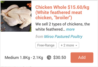
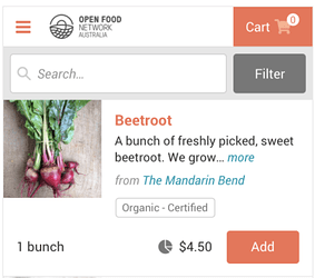
Restyle to look like the above
-
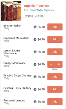
Change to the add products function, where you don’t type a number in anymore, you add and then hit ‘+’ or ‘-’ to increase or decrease the number of items in your basket.
-
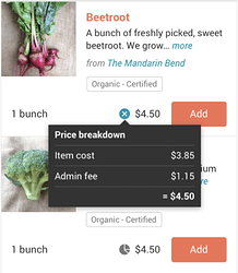
Inclusion of the price breakdown pie on mobile, and the ability for the pop over to close when you click anywhere on the page.
-
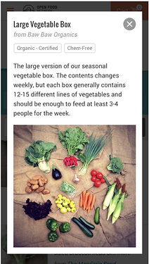
Re-jig of the product modal layout
NOTE: I’m looking into whether we can link directly to the product modal, in the lead up to eventually having individual product pages. Hoping this can be included in scope.
4. Search and filter products in the shop
Next up is improving the design and usability of the search bar and the filters. You can read all about the overarching epic and the problems we are solving here: [mobile ux] 6. Search and filter products in shop · Issue #4601 · openfoodfoundation/openfoodnetwork · GitHub
Changes in this release include:
-
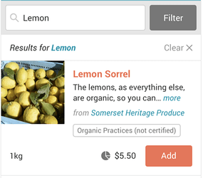
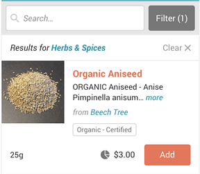
Restyle the look like the above
-
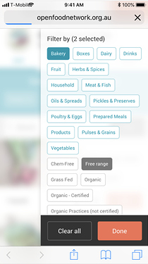
Product filters move to be in a menu on the right hand side of the screen, and you can scroll through them to select or de-select (aka no more + 2 more button)
-
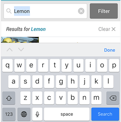
Clear button (
 ) in the search field.
 -
The search/filter bar “sticks” to the top menu bar as you scroll, so you always have access to it.
5. View cart dropdown
The final piece in this round of changes is to finish the restyle of the view cart dropdown, and have it display on mobile. I haven’t created an epic for this yet, will add a link here when it’s been created so you can read more about it.
Changes in this release include:
-
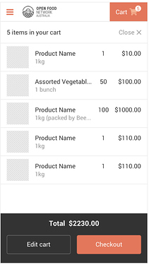
The drop down will display on mobile, taking up the entire screen. The user can touch the cart icon or the close button to hide it.
-
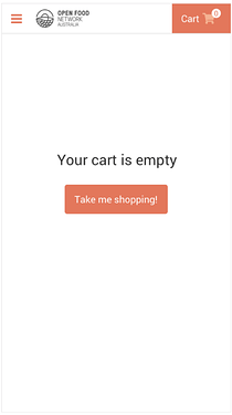
When empty on mobile the cart will have a call to action that directs the shopper to the last shop they were in, or to the /shops list if they aren’t in a shop.
Note: I feel like we also need the ‘close’ option to be on this screen just in case they want to go back to the page they were on and don’t realise that they can click the cart icon to do so.
Timing of releases…
…is sadly something I can’t give you 
What I can do though is give you a week’s notice so you can send out any comms to your users before they go live. Because each release is being built together in one piece to be put live at one, I have more ability to give you this notice (and potentially an extra week if it’s a big change and you feel you need more time for comms) in advance of the release.
Have you got questions or want some more detail about a particular part?
Well then, come along to the next global hangout, which is at 9pm GMT this Tuesday 11 February (8am Wednesday 12 February for Melbourne peeps). It’s easier to explain things while synchronously chatting and can cover off things collectively. We’ll record the hangout for those of you who can’t make it but want to see what we chat about.
Ping @tschumilas (CA); @Kirsten @Jen @EmilyRogers (AU); @lauriewayne1 (USA); @NickWeir @lin_d_hop @lbwright22 (UK) @Rachel (FR) @sauloperez (Katuma) @Permakai (NZ); @Bevan (SA); @Theodore (BE); and any other instance I haven’t included, Nick perhaps the Italian team?

 . I will add