Continuing the discussion from Mobile shopping ux improvements (an overview):
Update on progress for mobile shopping UX improvements
1. Shop content tabs
This work is mostly done. All that remains are some design tweaks requested by Yuko that are listed on the epic.
There’s one bug as well, where the “home message” field help text in the shop preferences tab is not displaying. This makes it difficult for shops to understand what this home tab is for or what kind of info should be in it. I’m going to create a bug for this and get it fixed.
2. Order cycle display
This work is mostly done. All that remains are some design tweaks requested by Yuko that are listed on the epic.
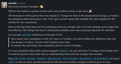
I’ve been trying to get some feedback from instance managers about whether the design change has removed the problem shops had where their shoppers didn’t notice the OC select section and thought the shop was broken. It’d be great to understand if there has been a positive change/response from shops with this improvement, any insights you all have would be gratefully received.
3. Product list
We’re still working through this one, not much progress to report. We’d been waiting for a design for bulk product which is now written up in GH and ready to be built, need to get a cleared amount of @maikel’s time so he can finish building the product list view (and also the price breakdown modal). Then I’ll be testing the design with a few users to make sure the bulk product version is intuitive 
4. Search and filter products
Most of the work is done on this, all that’s left is an annoying iOS bug where the keyboard doesn’t shut when you click ‘search’, and potentially a Yuko design sweep (not sure if it’s needed, waiting on confirmation)
5. View cart
@Matt-Yorkley is working on this right now, and the bulk of it is built and going through code review, hopefully I’ll get to test it later this week. All that will remain is a bug that was introduced when the new-look cart design was added a while ago.
Final review of completed work
Once we have all these bits done and in place, we’ll do a final sweep to make sure it all hangs together ok and there’s nothing untoward or clunky going on design-wise.
Yuko and I will put together a wrap up with possible/recommended next steps when this round of work is done. It’ll include things like recommending user testing on the home tab interaction, it’s new and we don’t know whether it’s solving the problem it was designed for which is to help shoppers understand how to shop with the enterprise. We reckon there’s a lot more opportunity with this tab (specials highlighting, pick up/delivery section, OC-related messages, etc) that haven’t been explored with this round of work. Along with changing up the way OCs are selected (and how to incorporate OC-specific messages and delivery/pick up selection earlier in the process of buying). And of course, there’s things like individual product pages that will make the list of future improvements.
OK, that’s it for now. Any questions get in touch on here or on slack using the #mobile-ux channel.

