What is the need / problem
Producers today have:
-
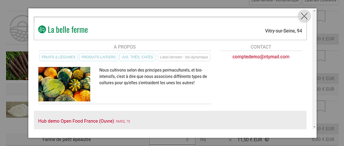
a long profile that shows when you click on the producer icon from the map (including map within a group page) or from shopfront
-
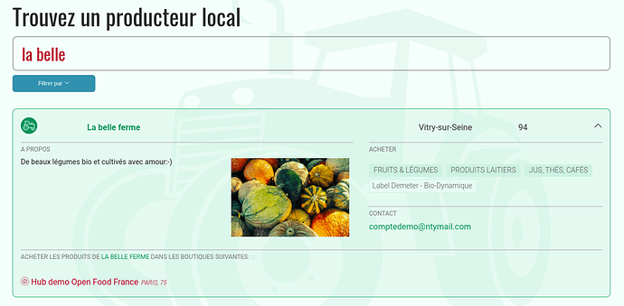
a short profile that shows on the dropdown when you click on producer name from producer menu (including producer menu in group page)
They don’t have any specific URL to something like a “producer page”, there is no really producer page.
Who does it impact
All producers
What is the current impact of this problem
Producers use what they have, their “long description text” to give important info, that visitors see only in the long profile. In some situations (from producer tab mostly) users don’t see those info.
(for instance in Australia, Lucy from the MALPN group raised this issue. This group’s full producer profiles all have ‘outlets/stockists’ at the bottom… she’s worried visitors to the site won’t see these if they look at producer profiles from the list).
So there is probably a need to review the UX for producer profile, ask ourself the question is producers need a page with their own url, etc.
What is the benefit in focusing on this
Improve producer visibility and ability to communicate to their (potential) customers and partners.
Links to more details
Potential solutions that will solve this problem
- Remove dropdown and just display pop-in as in other map and shopfront pages to display producer long profile (so short profile woulnd’t be used anymore and we would simplify the UX which would be good)
- Create a real producer page with a static url and display it within a pop-in in all the above case, but enable producers to share that url (we need to design that page in that case, see Kirsten comment in the GH issue mentioned above)

