Thanks Rachel for the feedback and questions. Here’s some inputs on those.
Will inventory tags keep working in parallel or will this be introduced to users who are not using inventory first?
Some time back we started dicussing this with @luisramos0 and @Kirsten, but we haven’t really come to a conclusion on the architecture behind tags in product list. It definitely needs some tech input before we finalise if and how it overlaps with tags used in other parts of the backoffice.
I’m not seeing any mention of product stock info vs variant stock info in the table uplift summary.
My assumption has always been that the product stock value is the sum of all of its variants’ stocks, so I kept it as is. If that’s not the case, or if there’s anything that has room for improvement there, more than happy to update.
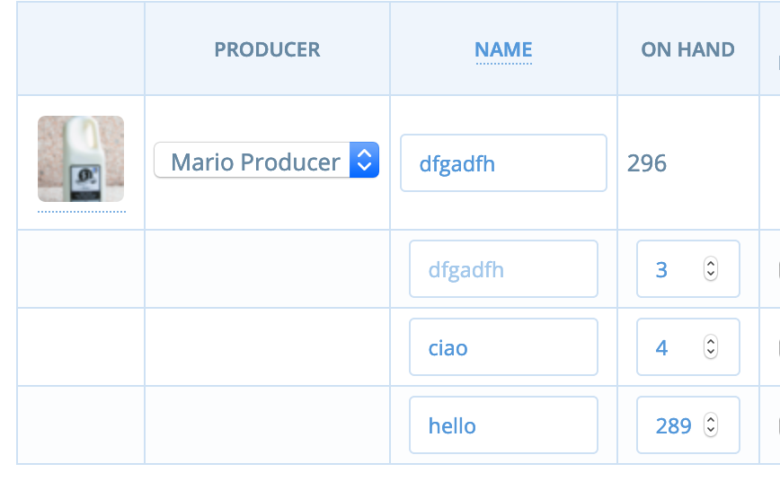
May I ask you to add in the prototype an example product with on demand stock info? I’m not sure I see how to do it
There’s no option in the prototype to change that. I’ve created a very simple prototype here to illustrate the behaviour (see lemons). It might need a bit of tweaking in terms of field size.
For items, unit display names is not shown in the prototype. Is this done on purpose?
At this stage I left it open for further exploration. I might be wrong, but it feels like a field that you would not change as frequently as others, so it might not need to add visual noise in the table. I hope that once we get analytics data for the backoffice this assumption can be confirmed or proven wrong. As a discussion point, I’ve included in the prototype in the previous point an option to see it - again on the lemons (it needs more UI treatment, it’s more for conversational purposes at this point).
As this page will be done from scratch, are we talking the chance to do something responsive right away or it’s too much work for a v1?
As I was progressing with the design, I also just started to look at some responsive options, but shortly realised that it didn’t feel right. Trying to squeeze the whole enterprise software into a small screen could be a massive effort, and I’m wondering how much value it would add. I would love to do a bit more research on this before committing to mobile responsive. Some questions that I have on this are
- Which mobile devices are mostly used at the moment?
- Who is trying to access on mobile (more producers or hub managers)? For which purpose?
- What would be the most valuable actions to be performed on mobile?
- As @Erioldoesdesign pointed out recently - how do we support slow/no connection on mobile to avoid losing progress on editing?
- Could this overlap with some API work? aka enabling other more mobile friendly apps to access the data
I would LOVE to tackle mobile as well, but I’m thinking that it might need a separate discovery/inception.
I like that the table uses more width space, but I wonder how it works on large screens. Price and stock info are the data that are the most used / changed, so they would end up on the left side of a big screen
I think once we get closer to dev we can start working through the contraints of this approach. We could set max width for both the table and each column as well, or apply rules that don’t stretch the table unless necessary…probably something that can be defined better in design / dev pairing during delivery.
The category stays at the same place as now, but this place is too visible I think. I would expect it to be closer to the name of the product. But again, this is a very personal opinion.
I don’t really have a strong opinion on this, so keen to hear others’ thoughts on it and happy to update.
Cheers!