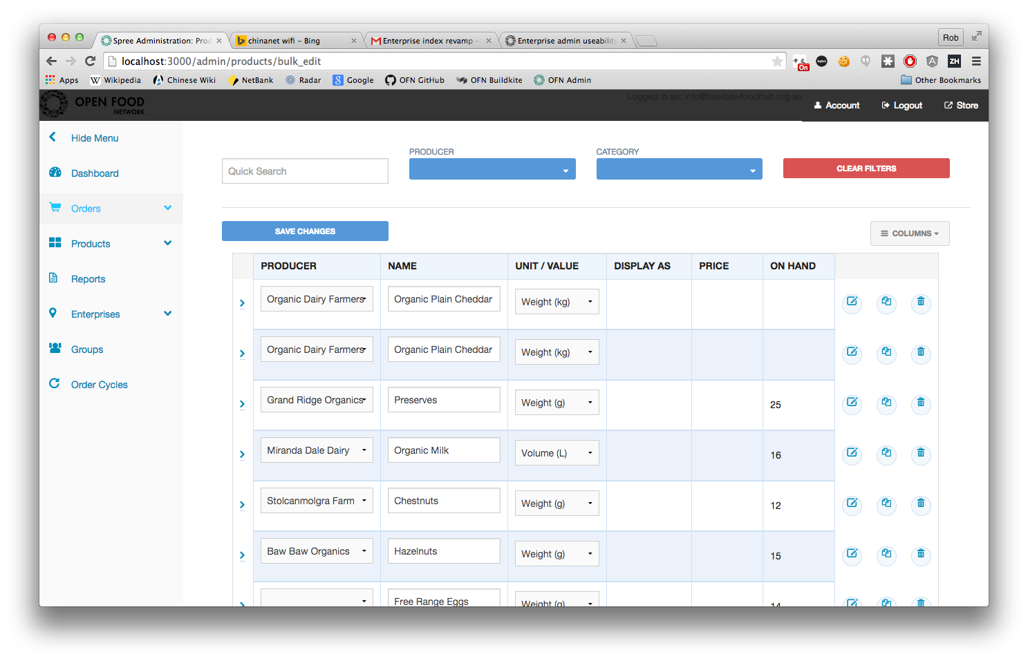
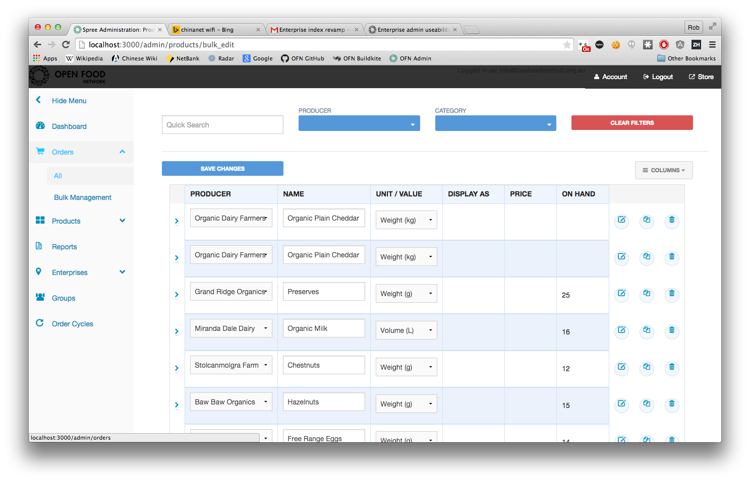
The menu for the backend is getting pretty crowded (and will only become more so)
The menu does not allow users to access a given page from any other page (for example, if you want to access Enterprise Relationships from say the products page, you would first have to click on Enterprises, which would take you to the enterprise index, and then click on Relationships in the sub menu). This is slow and tedious.
The framework that we use in the frontend (Foundation Zurb) is much nicer to deal with than the default Skeleton framework that the default spree admin interface is built in and it has some components (accordions, modals, etc) that would be nice to have access to in the backend.
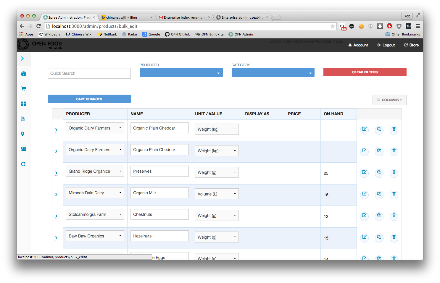
With these issues in mind, the Aus Dev team had a brief discussion about possible solutions and talked about the idea of switching to a side menu. I had a quick go at prototyping a side menu, and switching the framework from skeleton to foundation. There are some obvious styling issues that will need to be resolved, I haven’t done the work of rebuilding the page title and actions bar at the top of the page and there is quite a bit of work to do to fix the row structure on every page.
Thoughts on whether product upload feature could benefit from conversion of backend interface to foundation? @Kirsten and I were just thinking that maybe the addition of foundation modals to our toolset and a better flow for accessing sub-menu items may be beneficial…
I suppose the answer depends on how big a job it is, which I don’t have the answer to off the top of me head. I remember something like 20 hours being thrown around at one point but would have to actually look at where I got up to with this to give a better idea.
not just the product upload, anything we might be doing to improve admin side UX, which I think is also potentially a big priority for the possible french user @MyriamBoure
Yep, that’s probably something we can try to fund partly with our potential user if we sign, but maybe not in their MVP… maybe stage 2. If we get the grants we expect in France hopefully that’s something we would be happy to contribute to, to improve hub managers and producers UX…
I wonder if it would be possible to just grab the new stylesheets and drop them in? A general spruce-up would be really good, and that might be an easy option.
this will also potentially connect with @myriam’s new big user, although that could also lead to building a separate customised admin interface that talks to database using API
I think in our case there will be a separate producer front end (which might be something to think about more generally for OFN ;-)) but I think for hubs admin the current backend, with this improvement, will be good… I’ll discuss that soon with our contacts
It seems like there’s a number of big players on the OFN horizon… I think the visual impression people get when they’re trying out the platform can make a huge difference, so I sort of feel like an admin UI overhaul might be quite an important goal.
Hello people of the past! This thread is from 2015
I want to move that menu to the left!
I think this is so important for OFN.
This is not just about the UX and ease of use, this is about humans being biased when they make decisions. And the looks of an app UI are a massive influence on decision makers minds.
I’d love to work on this one during some of my volunteer time this year. Even if just to add more details and investigations to it.
One very important dimension to this epic is the solidus/spree fork and the relation with the UI improvement of Spree v3.
Context: we are on Spree 1.3 now and will soon be on 2.0.4. I am sure we will get to spree 2.1 in 2019 because spree 2.1 will enable us to move to rails 4 (upgrading from 2.0.4 to 2.1 will be a much easier than from 1.3 to 2.0.4).
After spree 2.1 there are still 3 steps to 2.4. Spree 2.4 is where solidus was born.
The important fact is that the big spree UI improvement was in v3 and so, the UI improvement is only in Spree v3. so, the latest versions of Solidus still look like OFN.
The other dimension to this is that we have a lot of customization on top of the Spree views, so the de-defacing of OFN is important because more and more views are becoming OFN views and not spree views, that means even if we upgrade to spree v3, we would still need to convert OFN views to that layout.
So, even if we decide to stay with spree, not solidus, it will take a long time until we get v3 and when we get v3 we will still need to work on our views to make it a good looking thing.
So, these are all good arguments to decide that OFN backoffice UI will be OFN specific in the long run and not dependent on spree or solidus UI. This is important to put forward so we can start making changes that may be incompatible with future spree versions.
I have no UX expertise at all and I would say : who has objective UX arguments on whether this menu should be on the left ? @Rachel mentioned a couple of time that we would need to agree on big basic UX rules, and said we would need data also for that (cf matomo).
Yuko did some work on mobile UX for instance, but shouldn’t we have some general work on our backoffice UX ? Driven by Yuko or someone else, but with some expertise and arguments about why this should be here or there.
I agree that UX is an argument for choosing this software or another, but I don’t think our UX is that bad actually… I saw other softwares, they also have their pros and cons… I don’t know if I would put that as a priority but I’m happy to hear other arguments
I have no UX expertise at all and I would say : who has objective UX arguments on whether this menu should be on the left ?
We cannot give UX opinion without user behavior info. So either we launch interviews in this field or we plug tools like matomo there. This is why I opened: Enable Matomo to measure backoffice and actions
(doing both would actually be the best way).
Once this is done we also need to make strategic decisions like: do we want the backend to be responsive?
If yes, the menu on the left will be necessary.
I had in mind that this would come with the next Spree updates but I didn’t had in mind the problems it raises, thanks for clearing that @luisramos0
So this can be the first step for an overhaul.
But at the same time I’m wondering: will a left menu change a lot the rest of the platform? Maybe having someone testing stuff could also be good. How did you wanted to proceed @luisramos0? Will you need some UI work to lean on?
There’s no right or wrong solution in terms of menu position, the menu on the left is a general industry tendency and it supports more vertical space for the app and less horizontal (this is good for most laptop/desktop screens).
Apart from the easier (single click) access to submenus mentioned by Rob above, there’s also the space that the top banner is currently taking with the OFN logo and “Logged in as”. Maybe we could work on making this banner smaller… that could be a lot easier to agree and implement. Has this been discussed?
Or shall we go for what Rob is proposing above? The screenshots look great don’t they?
Thanks so much @luisramos0 for explaining the process and issues re: going to Spree 3 - this is the first time I’ve understood this. I wonder @Rachel - would you mind explaining what ‘do we wan thte backend to be responsive?’ means. (Sorry but seems like an important concept and I need to understand it.)
In terms of the UX - frankly, as a user working with other users with very limited experience with other similar software - I don’t see that simply moving the menu is a big advantage. I understand if left is an industry tendency - but our users aren’t very experienced in the industry to know this anyway. But - I also understand and support single click access – even without (so called) ‘objective’ user data - it seems to me making things with fewer clicks is a no-brainer that we don’t need to over-think or over-research. BUT - I’m interested in the other UX things - and perhaps making a longer term UX plan/strategy - so we can fit the steps in toward that? LIKE - small pop ups when you hover to tell you little tips etc. — that you can turn off once you don’t need them anymore. I love this when I’m learning a new app/software package. Second - I want to raise the question of ‘backend/admin layout overhaul’ for whom Our producer users (suppliers and simple direct to consumer shops) are really lost in backend complexity they don’t need. What if this backend admin overhaul targets more complex hub-type users, and we develop a plan for some kind of app-like interface (I have no idea what I’m taking about - just guessing here) - that a simple shop can do as a kind of cut down way of getting up a product list… ??? (sorry if my guessing is out of line - but we need to somehow embrace the fact that we have users with really different skill levels and needs - esp if we imagine this to be a global platform with farmer users in the global south one day…)
Don’t worry at all @tschumilas you were right to ask, I shouldn’t have use that word like that sorry.
This explain briefly why the industry tendency is to have left menu : it’s clearer on smaller screens (you can make it totally disappear easily also).
What you explain is exactly why I propose we have some kind of analyze of our user behavior on the backend before taking large overhaul decision. We might be surprise - or not - by what comes up, but at least we would have a clear view. Maybe each instance manager already has this for its users, and it just need to be curated.


