User guide testing feedback

I am going through the use guides and just picking out any issues when I see them. So far this is what I have found to be confusing/ a user issue etc.

  • When in the producer user guide, the side menu does not correspond properly with the BACK and NEXT buttons at the top of the page. Eg. when on the ‘producer profile types’ page, the next button suggests that next ‘to the dashboard’

but the side menu shows that this was the page prior. You end up seeing the dashboard page twice and getting lost.

  • Thanks Sophie, fixed this -@sstead
  • Also, for the BACK and NEXT buttons, it might be easier for users if they were at the bottom of the page so that you can methodically work your way through the whole user guide, being prompted to the next page once you’ve reached the bottom

I’m going through the guides as well, will be adding replies on this thread to try and keep them in one place.

My first thought is ‘Advanced Features’ seems a little scary. Perhaps rename this section to be something like ‘Things to know once you’re set up’, or ‘Bonus features’, or something that indicates to the user that they need to get set up first, and then once they’re comfortable they can start thinking about extending their use of OFN.

*Keeping “Advanced Features” for now -@sstead

On the user guide landing page is it worth adding more of an explainer for first time visitors about what they’ll find in each section? And make the button copy more of a call to action, e.g. ‘Learn how to set yourself up as a hub’ rather than ‘Hub set-up guide’. At the moment the buttons in the body content are basically the equivalent of the left hand menu, regulars will use the menu to deep dive in, but newbies may need a bit of hand holding and another demonstration of OFN friendliness.

Probably not a priority for launch though.
*Yep good idea, have added a brief intro -@sstead

I recommend having all links within the copy open in a new tab/window.

e.g. the first step on the creating and editing a hub guide:

  • Yep, that makes sense, fixed-@sstead

The design of the left hand menu makes it difficult to differentiate between the second and third levels (same font colour, same font size, minor indentation). Would suggest it needs to be a stronger difference (e.g. make the font smaller, or indentation more pronounced, or change font colour or background colour).

Hey @openfoodnetwork, looking through the hub set up guides (especially this page - http://global.openfoodnetwork.org/platform/user-guide/hubs-set-up-guide/hub-profile-types/) I got a bit confused around the terminology we’re using, which led to a train of thought around account types that I’m adding here.

The thinking started when I was trying to understand what a ‘Shop Profile’ is versus a ‘Hub Shop’? Does a Hub Shop have a profile too? Are we using descriptors for these things that people will understand the difference between?

What I mean is, at the moment you’ve got it set up like this:

  • Hub Profile Type
    • Shop Profile
    • Hub Shop

From what I know, a ‘Shop Profile’ provides any enterprise, be it the Baw Baw Food Hub, or an organic grocer like Naturally on High, etc, with a means to promote their food enterprise via OFN. But then, these enterprises can take it one step further by actually selling their wares through OFN, which is where ‘Hub Shop’ comes in. Thus an enterprise can just promote, or promote and also sell, through the OFN. This being the case, these two types aren’t as much Profile types as Account types, because your profile is one of the things you create on OFN and the selling bit has nothing to do with it.

I would suggest instead that these are two options on how to set up a hub account, the initial basic set up and then the adding on of the ‘Online shop’ module.

How this would work: is when an enterprise sets up their account on OFN, they also set up their profile (ie. OFN Hub ‘Basic’ Account = OFN Profile). Then, if the newly created Hub wanted an online shopfront as well this would be extending their account to become (ie. OFN Hub ‘Plus’ Account = Profile + Online Shop).

This is a major change, I know, but I thought I’d throw it out there for consideration. It would mean the start up process would be something like:

  1. Create your OFN enterprise account (OFN Basic Account)

    • Add your details
    • Create your profile
      RESULT: You can now promote your enterprise on OFN
  2. Upgrade and add an Online Shop (OFN Plus Account)

    • Set up your online shop
      RESULT: You can now sell your stuff online using OFN
  3. Upgrade and add on a new sparkly feature (OFN Plus Saffron Account)

  4. Upgrade and add on another new sparkly feature (OFN Plus Truffle Account)

@sstead was telling me about service agreements that are looking to be put in place for enterprises, which sounds similar but I wonder if it’s clearer for users to talk about these agreements as Account Types, each of which has an associated service agreement along with access to particular features?

In the steps for creating and editing a Hub profile (http://global.openfoodnetwork.org/platform/user-guide/hubs-set-up-guide/):

  • Perhaps add in step 1 what information they’ll need for the registration process (e.g. address, profile blurb, images, social media links, etc). And also the fact that by creating an account they’ll be creating a profile page for their enterprise.

  • Step 1 and step 2 are definitely a sequential set of tasks required to finalise an account on OFN. But steps 3 and 4 aren’t really steps, they’re one off tasks that you can do to edit your account that don’t have to be done sequentially.

—yep, I think I’ve clarified this. Made step 1 its own page, and fixed language on step 3&4 so they know it’s not a step, just a feature they need to be aware of.- @sstead

The Hubs your profile guide - Does this display differently for enterprises that don’t have a shop front compared to those that do? Some of the steps on this page are only relevant to those hubs that create a shop and I wonder if this stuff should be separated out and referred to separately?

http://global.openfoodnetwork.org/platform/user-guide/hubs-set-up-guide/your-profile/

Further to this, when I looked at the Dashboard page for Food Hubs it confirmed that there seems to be a bias in the content towards Hubs that have shops. All the information is skewed towards them. When you’re just a plain old profile, no shop, what experience do you have? Is all the shop-stuff still displaying on the dashboard and profile update page and you just have to work around it, or is it all hidden? I can’t tell based on the user guides for hubs. Do you even get a dashboard when you’re just a profile?

  • Good point, yes, I’ve fixed the language so it caters to both profile and shop users- avoiding having serparate pages, so just saying ‘this feature only applies to users with a shop’ - @sstead

Page titles - suggest that you put the sequence in opposite order, and show the heirarchy in the title as well.

So have something like this:

Your Profile - Hubs set-up guide - Open Food Network

Rather than:

Open Food Network - Your Profile

Doing them opposite means that when you have 4 tabs open you can see which is which rather than having all of them say the same thing. See what I mean:

On this page: http://global.openfoodnetwork.org/platform/user-guide/hubs-set-up-guide/create-or-connect-with-supplying-producers/

This paragraph scares me as a user:

“Further, for a hub to sell products on behalf of a producer, the two enterprises must have the appropriate Enterprise to Enterprise permissions (E2E). This will be discussed below and in greater depth here.”

I get that it’s pretty tough trying to describe this stuff, but that last sentence referring to 2 lots of information about E2E premissions basically says ‘Danger Will Robinson’ to me and makes me not want to read it, and to take a deep breath!

Is there any way at this point in the guide to break E2E stuff down into chunks, lay out for me the high level things you’re going to be covering, rather than leaving me with no idea other than it sounds scary and I’m not sure if I should read below first or click on the link first and just dive in.

Perhaps, instead of talking about creating/connecting producer profiles and products first and then E2E, it seems like you need an E2E before any of the online linking stuff happens so should you be talking about that as the first step (the creating/connecting second) as part of a bigger thing that is ‘Adding products to your shop’?

Ultimately, you’re trying to sell particular products from particular producers.
To do this you need to:

  1. Have an E2E agreement with that producer

    • All the steps to do this listed out in one place preferably
  2. Connect to those products on OFN

    • Connect to the products if that producer is already on OFN
    • Set up that producer and their products on OFN

This seems perhaps a better information path to take the enterprise through understanding the process. Think of it as what are they ultimately trying to do (add products), what are they steps they need to take to do this (E2E agreement, connect to products from a producer profile on OFN), and how do they complete each of those steps.

Thanks Sophie, fixed this.

Have added to github some issues that we’ve covered in here:

572 - creating permanent redirects to the old site for when the new one goes live to stop an increase in 404s

573 - favicon issues

574 - order hierarchy for page titles displaying on tabs

Just going through the user guide with a fresh set of eyes. The following are things I didn’t understand and small errors:

-When selecting Hub Shop it says your free trial has now started but there is no mention of this in the user guide. Maybe an explanation of what this means may be useful in the user guise so people don’t think they’re going to get charged big extra fees after 30 days.

-As previously mentioned back and next buttons at the bottom of the page would improve the flow of reading through the guide.

-Throughout much of the user guide pictures/icons are not shown, only a small square is seen. This is especially important when specifically referred to in the text, such as on the Shipping methods page under postal service the text refers to a screen shot which is not shown. (SS- Fixed)

-In the last paragraph of the Products Page the image shows the expanded version of the screen. It maybe useful to instruct the user to expand the table by clicking the link on the top left

-On the payments methods page I got completely lost at ‘solution type’ and ‘landing page’ in regards to paypal. It asks to ‘enter the red text’ but I couldn’t see the red text. Granted I didn’t go through the whole process of setting this up but I still think maybe this could be more clear. (SS- Fixed I hope)

  • There is no text under 'Masterclass Internet Gateway Service MIGS. Should there be an explanation here? (SS- Fixed)

-On the Orders page the following text is repeated twice- You could also then see the emails of these customers, and send them an alert. An alert is not automatically generated when adjustments are made in bulk order management. (SS- Fixed)

-Under Assigning a property to an Enterprise is this text- I am text block. Click edit button to change this text. Lorem ipsum dolor sit amet, consectetur adipiscing elit. Ut elit tellus, luctus nec ullamcorper mattis, pulvinar dapibus leo. (SS- Fixed)

  • spelling errors: (SS- Fixed)
    Shipping methods> Creating a new shiping method> Name - postal servie -> postal service
    Enterprise Fees> Creating Enterprise Fees> Flat rate (per item)- contant -> constant
    Create or connect with your supplying producer> Supplying Producer- Producers can grant hub -> producers can grant hubs
    Reports> Mailing List- stock outs of changes -> stock outs or changes

Cheers :smile:
Mon

Thanks Mon! Amazzingly helpful! Glad you picked up those dud image links, they looked terrible!
“In the last paragraph of the Products Page the image shows the expanded version of the screen. It maybe useful to instruct the user to expand the table by clicking the link on the top left” - sorry not sure what you mean here?

Hi Sally. Thanks for fixing the variable weights link
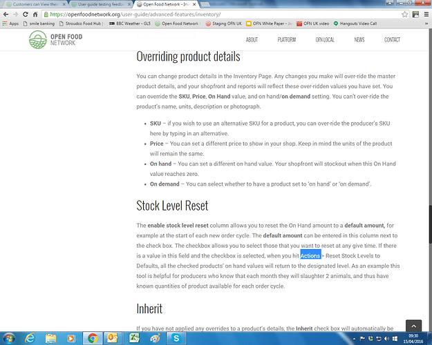
One other minor thing that @Sara and I spotted the other day was the signposting to Steve’s new inventory managment functionality. We think it would make this easier to find if the word ‘Inventory >’ was put in front of the word ‘Action’ highlighted in this screenshot
thanks again for all your work - it is very much appreciated over here

Thanks @NickWeir I’ve just update this now.

Hey everyone ! In terms of UX, I think the user guide is missing a “search” or “ask your question” box, delivering or suggesting content/sections depending on the words typed. What do you think ?

1 Like

Completely agree @Arthur! The userguide maintained by @sstead is in WordPress, I imagine it would be fairly easy to integrate a search function onto that section of the site.

The question is who has sufficient WordPress skills to be able to do this work. Any volunteers?

I agree, this would be a huge help to users! I don’t have the wordpress skills unfortunately, anyone else?

Agreed, important feature.
Having looked at the structure of the user guide, we need to add a plugin that will enable us to set the search parameters to only look in the pages under the ‘User Guide’ structure vs the whole website.
From there, we would need to place it in the left sidebar menu so that it remains visible on each of the sub-pages within the guide to search from each of those.

There are a few options, but we may want to step back add it to a list of how to rework the guide when we set up translation, as it may have to become a stand-alone versus integrated within the main .org page.
We may also need to update to Avada 5.0 in order to manage the language issues.

Open to other suggestions. Anyone?

potential plugin: https://wordpress.org/plugins/search-everything/