OFN Footer in Order Confirmation Email is confusing to shoppers

What is the need / problem ?

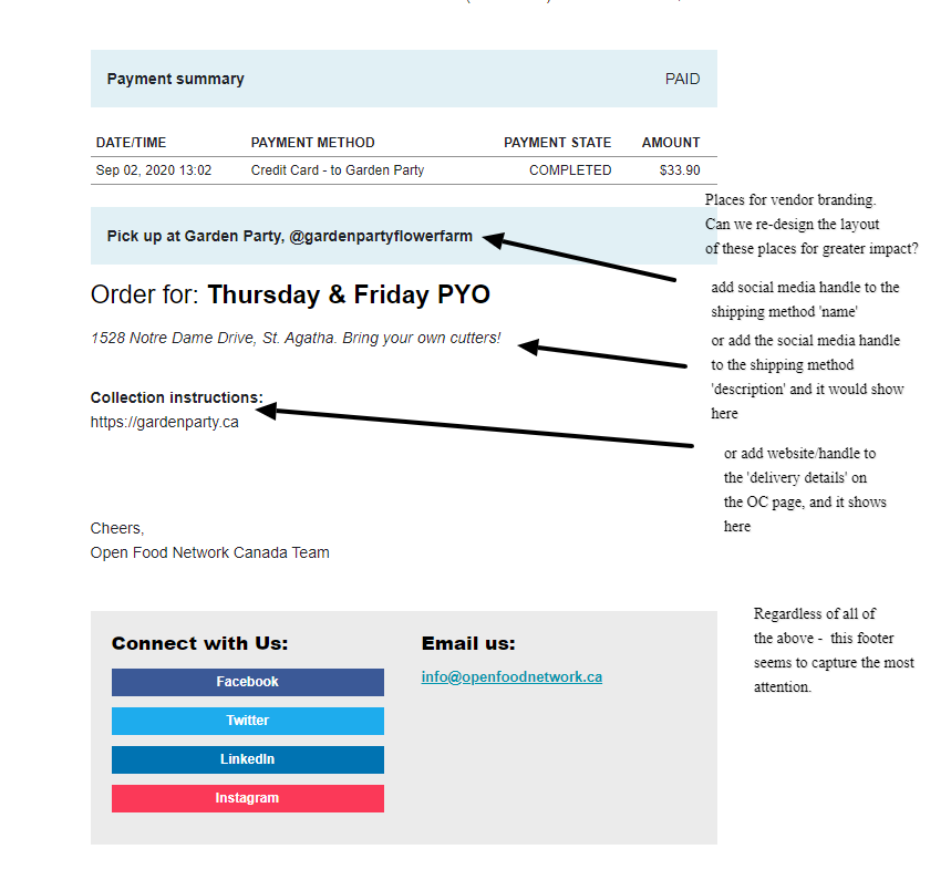
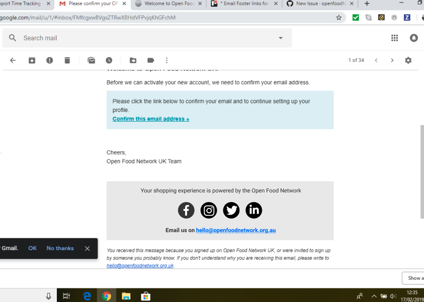
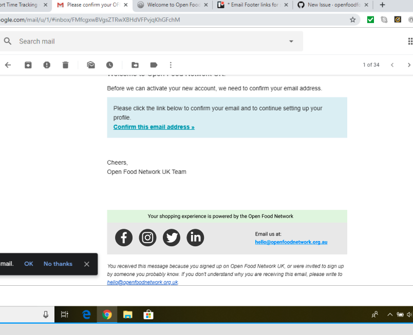
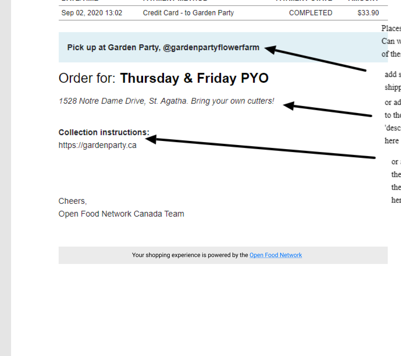
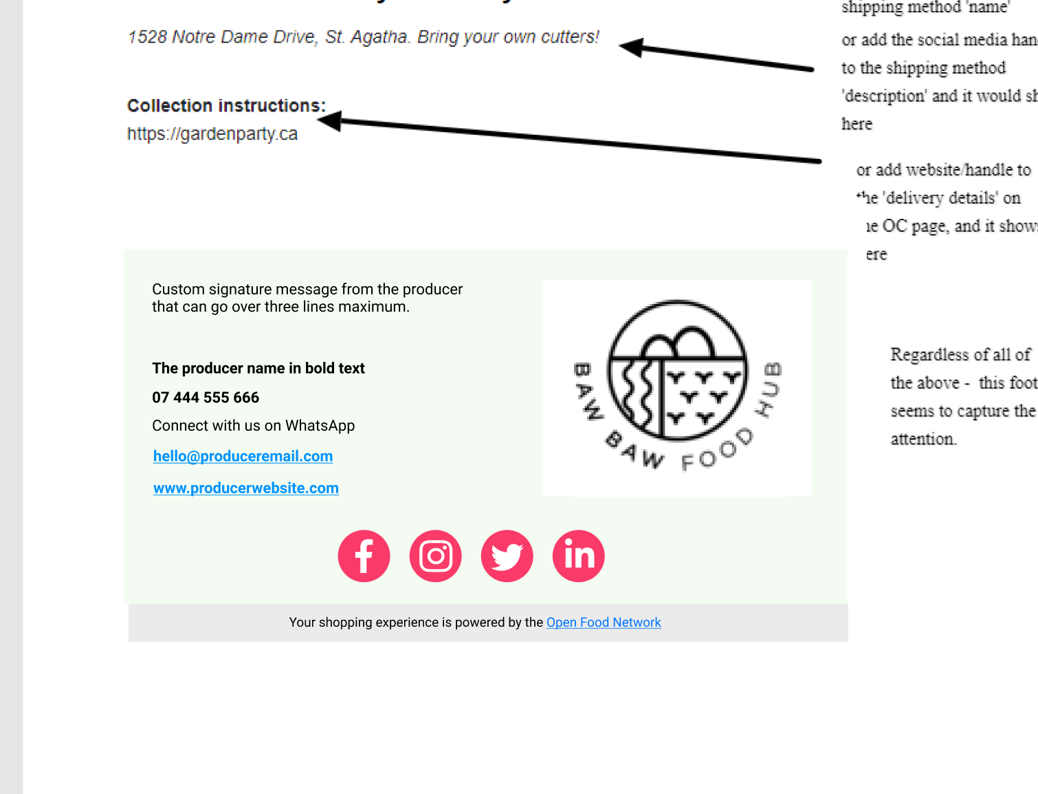
In May 2020 an OFN branded Footer was added to the bottom of Order Confirmation emails. Order confirmation emails are sent to customers who place orders with an Enterprise. The new footer has prominent social media buttons that link to OFN branded destinations. Previously the Footer on this email was drawn from Enterprise variables including the enterprise name and contact details.

Adding an OFN footer below this Enterprise Footer has created confusion for shoppers, who have started emailing OFN when they think they are emailing the Enterprise (eg order changes, payment queries etc)

The OFN footer was added to these emails as part of this Issue:
Add extra (Instagram) social media links to emails sent to customers and users #3509

Who does it impact ?

Shoppers (customers of Enterprises) are impacted as their enquiries are misdirected to OFN when they are intended for the Enterprise.

OFN Customer Support teams are impacted as they need to identify the correct Enterprise, and re-direct the enquiries back to the intended recipient.

What is the current impact of the problem ?

It is inconvenient and a poor customer experience for shoppers. There is a loss of brand equity for Enterprises. OFN is required to be an intermediate between Enterprises and their shoppers, when the shoppers donā€™t understand who OFN is or why they are part of the conversation.

What is the benefit of focusing on this ?

This was a recent change that was made in order to improve the OFN brand profile, but it has inadvertently created a negative experience for both shopper and Enterprise. As it hasnā€™t added value - and has potentially created a negative brand experience - it makes sense to reverse the change.

It has been discussed that a wider discussion is warranted, where we review the bigger picture of how Enterprises interact with shoppers, how much control Enterprises should have over these contact points, and how OFN fits into this picture.

Iā€™d like to suggest we raise a separate wishlist item for this broader discussion.

Potential solutions that will solve the problem ?

The issue mentioned above #3509 discusses in detail the change that was made to add this footer (although it specifically references the UK instance).

Resolution options include:
a) removing the footer (effectively reversing the change made in #3905)
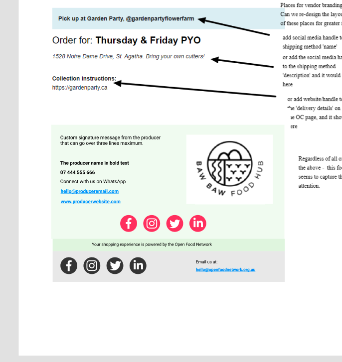
b) amending the footer and branding so that it is clear how to contact the Enterprise with whom the order was placed.

Selection of a feature candidate

T-shirt size of our selected feature candidate

The initial GitHub issue to create the footer was labelled as a Good First Issue. This may be also.

Metrics to measure if need is satisfied after feature is implemented

The current footer does not appear in Order Confirmation Emails. It is either removed, or an amended footer appears.

Feature owners

Epic/project where you can follow implementation


Connected wishlist and discovery discussions*

Add extra (Instagram) social media links to emails sent to customers and users #3509

In Canada also - OFN continues to get emails from customers that we have to re-direct to the shop. I concur that the footer on the order confirmation is part of the reason - it stands out to the customer more than the other information.

Consider the order confirmation pic below. We have been urging vendors to do things like: add their social media handle to the shipping method ā€˜nameā€™ field, or to the shipping method ā€˜descriptionā€™ field, or to the ā€˜delivery detailsā€™ field on the OC. All these fields show on the order confirmation. But they are not stylized like the footer. So even though the vendor contact info is there, it is the footer people notice. Could we re-stylize?

1 Like

Seems like this could be solved with some prominence adjustments ie. the big band and buttons would be the enterpriseā€™s contacts and social media etc

Then we have a smaller, grey or whatever footer that says ā€œPowered by the Open Food Network . . find out moreā€ or whatever and little fb, insta icons etc - likely for the local instance?

Aligned with @Kirsten 's proposal.

As I received too many customersā€™ email I was hiding our contact email as much as possible on the website. But I completely forgot the confirmation email. Now that makes more sense than feeling all our customers are super detectives :smiley:

I think itā€™s not the first time a papercut introduces something unwanted. Iā€™m wondering if we should change something in the process of how we allow them to be created :thinking:

1 Like

I donā€™t know about that @Rachel - consider all the papercuts, and this one time. Odds arenā€™t that bad - and we are bound to have a few things like this now and again. I wouldnā€™t re-focus the process based on one example. It doesnā€™t seem to be a very common occurence.

Are we in agreement that we want the following:

a) much reduced size and visual prominence of this footer as compared to the Producer Footer
b) introduce a ā€˜powered byā€™ message and text to communicate that this footer is not the shop/producer
c) replace red and blue icons with small social media buttons

So the new footer:

  • As narrow as possible
  • Keep the pale grey background
  • Include the text: Your shopping experience is powered by the Open Food Network
  • A single row of small, round, grey social media & email icons below this line of text
  • Suggest icons similar to the below (grey on grey)

Screen Shot 2020-09-10 at 3.37.53 PM

Do we need a designerā€™s input or is this enough of a briefing??

@Erioldoesdesign would you be happy with design proposed above? would a mockup be useful? I think this will be going in as Aus papercut in next round so I think it would be ok to be investing design to make sure itā€™s clear? (process thoughts on that @Jana @Rachel?)

1 Like

I think I agree it needs design input. The list can be interpreted too much otherwise.

But if it needs to involve design Iā€™m wondering if it is still a papercutā€¦ we need to have time for design + dev + tester, which can be tricky when new design are introduced (testing all browsers etc).

What do you think?

1 Like

@Kirsten I think a mock up would help visually capture what is good design balance between a visible OFN footer and what I think is a ā€˜producer signatureā€™ for their socials. Whether itā€™ll end up being a papercut e.g. taking less than half a day dev time Iā€™m not 100% certain :thinking:

Can I get some clarification on what was changed in this PR though: https://github.com/openfoodfoundation/openfoodnetwork/pull/5259
Iā€™m not clearly understanding what was done? maybe @luisramos0or @filipefurtado can help?

I came up with this in about 20 ish mins: https://www.figma.com/file/vHASI22Wc80AAHPgIc2ZNi/OFN-footers?node-id=0%3A1

If itā€™s hard to see the OFN footer treatments on this link here are screengrabs:

Just to clarify i think the above is papercut territory

Making the producer signature/footer better is definitely outside of papercut territory :frowning:

Mostly because the producer signature/footer will need to look at how itā€™s configured in the back office/or where else that is configured (which Iā€™m not 100% sure on yet)

Also! you might be wondering why Iā€™ve made the social circles ā€œbigā€

Whoever codes this new footer in the email layout should take a look at the mobile screen size media query HTML/CSS code to make sure that if someone is viewing this email on mobile the footer icons are displayed well.

The minimum recommended size for any button/tappable/clickable area for a human finger/thumb is 40 pixels either tall or wide. Any smaller and even people with good dexterity in their fingers struggle to tap/click on a button/icon

Accessibility people! lets start improving this :wink:

1 Like

I like the 2nd one with the green bar better

I would like to see the shopā€™s signature / links included if we could - Iā€™m not sure that there is any need to consider back-end configuration as the info is all there already. Itā€™s basically just a display of the info thatā€™s in their Contact tab on the shop e.g. https://openfoodnetwork.org.au/wangaratta-farmers-market-hub/shop#/contact

I think this would alleviate the main REASON that people email us accidentally which is that the first / only email they can see to click on is ours. Putting a similar box above ours with the logo and contact info of the Hub would change this

The producer sections on the documents were finished shortly after I posted about the other parts. Above are screengrabs from the Figma file.

1 Like

I find the first and second images above to be just as confusing as what we have now - Iā€™m sorry to say. I think its because there is only 1 set of social links - and that they are OFNs. But in the last example - its more clear that there are 2 sets of socials and thus 2 contacts possible - so to my eye, it forces me to spend an extra half minute to understand who I would want to contact - rather than just click a link or an email. I think we need to buy that extra half minute from the customer somehow. Also - I love the possibility of a user putting a few customized lines if we can swing it as a papercut. But if not, Iā€™d say lets change the footer within the boundaries of ā€˜papercutā€™ ā€“ it will save support teams a lot of misdirected messages and emails.

1 Like

I tend to agree with @tschumilas that the above solutions are still not providing enough clarity to shoppers about who to contact. There are very few scenarios under which a shopper would legitimately want to contact the Open Food Network after receiving an Order Confirmation email. It may be a 1% kind of scenario (??)

I agree with @Erioldoesdesign that we need to take accessibility into account, so I donā€™t know how we achieve this, but by making our social media links as large and prominent as the Producerā€™s social media links, I think thereā€™s still plenty of confusion here.

Is the answer:
a) make our footer even less prominent
b) include more clarifying text ahead of our contact details eg. ā€œFind out about having your own shopfront on OFNā€
c) limit the OFN contact options to a single email address or URL?
d) something else?

Itā€™s also worth throwing it out there that we only recently added an OFN footer to this email. Are we absolutely certain that we donā€™t want to simply remove it again?

So I think thereā€™s a piece of work to be done re. auditing our current email comms and categorising them.

One part of this categorisation could be asking the question: 'Would a shopper want to contact the producer or OFN after reading this email?"
if yes > add OFN footer
if no > no OFN footer

A case for a shopper wanting to contact OFN so OFN footer = yes would be any part of our registration process.

A case for no contact to ofn so OFN footer = no would be a purchase confirmation.

But!! there may be actions you want shoppers to do like maybe, ā€˜tell a friend you just bought from producer x using ofnā€™ that could be a link text that does a social share.

Anyways I think that papercut wise, removing the OFN footer in certain emails or your option c)limit the OFN contact options to a single email address or URL? (where I would suggest just a footer with the www.openfoodnetwork.org.au) is papercut worthy.

Any more reasoning and exploration (such as this thread) is sort of going into inception work and wishlist item territory. But a good conversation to be having, just hard to be prioritised along with ā€˜all the things!ā€™

1 Like

As I recall, one of the reasons we added the OFN footer is that we had wishlist discussions (which I now canā€™t find) related to the idea you raise @Erioldoesdesign. That is, we might want to get shoppers referring the shop to friends. Further, we talked about opening up the opportunity for policy advocacy where we link the shopper to various campaigns or other food sovereignty work going on in that local instanceā€¦ So - ā€˜thanks for buying on the OFN. We are actively working to make our food systems more just. Support this petition giving agricultural land access to indigenous communitiesā€™ ā€¦

So - I donā€™t think we want the OFN footer totally removed. So I like c too.

1 Like

Hi everyone, I can see how this at once could be such an easy fix but at the same time needs to fit into a broader strategy of the role OFN plays in our food systems.

The platform is meant to help create direct and transparent relationships between shoppers and producers. And right now our footer is getting in the way of that.

So I vote for Option C making the producerā€™s signature the most prominent. Visually the shopperā€™s eye will be drawn to their signature for anything related to their purchase.

But we are more than just an e-commerce platform. And I take @Erioldoesdesignā€™s point about accessibility but that does mean that our social icons compete with the producerā€™s.

Iā€™m of a similar mind to @tschumilas - instead of including OFNā€™s email address and social icons in the footer, I suggest we include a sentence like ā€œYour shopping experience is powered by the Open Food Network. Get involved in creating fair and transparent local food systems here (ā€œhereā€ is linked to our website)ā€ or something like that.

2 Likes

agreed re. papercut territory itā€™ll be more like:

Or one day, when we can have nicely configurable producer footers like:

If someone knows of a thread or epic that already describes the ā€˜Service designā€™ of all email comms Iā€™d love to bookmark it. As people ā€˜powering a serviceā€™ like an e-commerce platform we often donā€™t give the attention necessary to the comms design/delivery. Itā€™s not currently a priority re my time but I would love to still know if some discussion exists. :slight_smile:

Thanks so much for everyoneā€™s input :slight_smile:

I think I can now move to create an issue in GitHub around option c) above and tag it as a Potential Papercut to be reviewed.

One last question. I believe the current OFN footer can be edited by each instance. Am I right to assume this would be done using translations? If so, should the destination of the single URL be left for each instance to specify using translations?

What should the default link be:

a) email to hello@openfoodnetwork.org
b) https://www.openfoodnetwork.org/