What is the need / problem ?
When I increase the quantity of an item, like so:
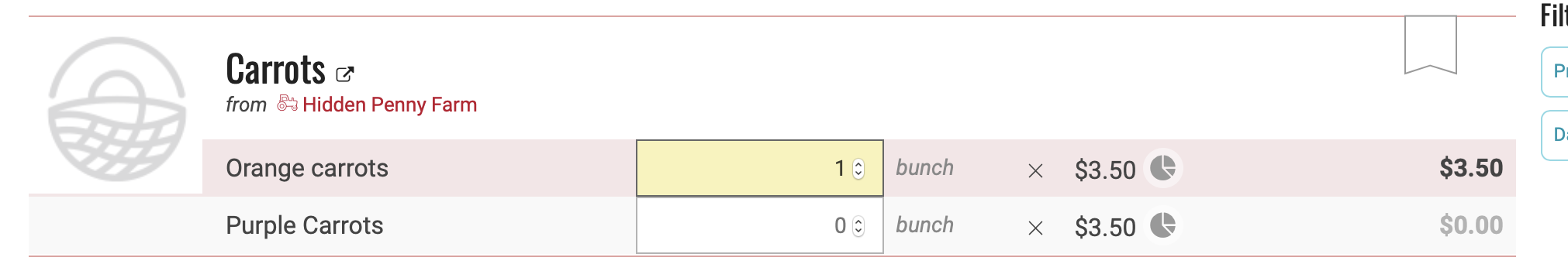
The only thing that happens to indicate that the item is now in my cart is the number in the upper right changes from 0 to 1. As a new user it took me a while (well, several seconds, but that’s a while!) to realize 1) that’s where the cart is and 2) that increasing the quantity picker is all it takes to add an item to the cart.
Who does it impact ?
New users in particular
What is the current impact of the problem ?
I obviously don’t have data to back this up, but I’d be willing to bet that at least one person in human history has tried using OFN, gotten confused by this, and given up.
What is the benefit of focusing on this ?
Prevent people from giving up!
Potential solutions that will solve the problem ?
We could have the cart animate, or display a toast that disappears after a few seconds to briefly draw the user’s attention to the cart in the upper right.
Selection of a feature candidate
I’m not sure what this is, I’ll investigate and update.
T-shirt size of our selected feature candidate
Hopefully XS-S
Metrics to measure if need is satisfied after feature is implemented
If we track page views/activity, we could measure if there’s an improvement in how many people don’t ever view their cart after adding an item.
Feature owners
TBD? Me?
Epic/projet where you can follow implementation
TBD?
Connected wishlist and discovery discussions*
[list precedent discussions]
 Can you have a look at the new shop design that should be live soon? Especially point 3 here: