Near the “about” button on the top menu, would it be possible to:
add a “donate” button (each instance will decide how to name it, support, contribute, donate…)
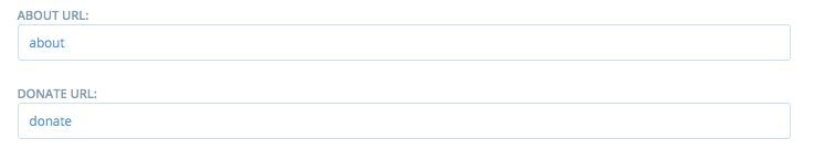
this button would lead to a html page that is customisable through the “content” menu in “configuration” (super-admin). So it means that we can either only integrate one système or redirect to an existing page (paypal buttons, like https://openfoodnetwork.org/about/donate/) or propose the supporters to give by different way (Wikipedia style: https://wikimediafoundation.org/wiki/Ways_to_Give)
We want in France to integrate a Liberapay widget on the top menu (to start with before we move forward on other options), but ideally we would like to offer different options (we like the values of Liberapay but not the most practical way to give…) so we can either do that as a French hack, or if you like the option, maybe we can work for the whole community on it? If @nickwhite or someone else in France can do it of course
@nickwhite I’m wondering if that wouldn’t be better to have a html content box where we can really code a full page (like for the producer signup page for exemple)… or should we say that we host the donate page on our respective instance websites, and each instance just redirect from the marketplace platform to that page? (like your current version) Maybe that’s enough actually…
What do you think @Kirsten?
Hi there! I completely understand why you would want to add a donate button to the top navigation bar, it does seem to deserve the prominence that this position will provide.
However, I have 2 questions:
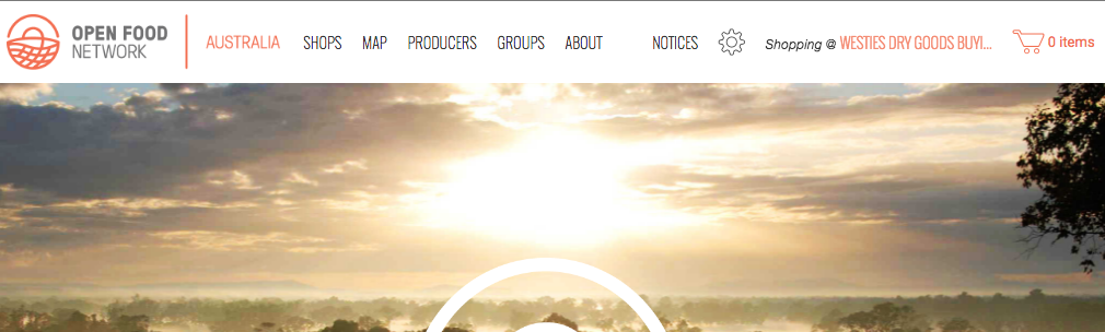
Question 1: Will it make this top bar look squashed? Currently, this is how the navigation bar looks when it’s got a long shop name and the user is logged in, if I make my browser window resolution almost 1024pixels (which is the point at which the website changes to mobile hamburger menu):
Adding another link to this, in my opinion, isn’t possible given how tightly squeezed they all are at this resolution. If we were to add a donate link then we would need to remove one of the existing links. An option for this is to remove the “About” link, as it’s quite normal for people to look for this information in the footer of a page rather than having it at the top. So this is a question for all (@serenity and @Kirsten and @sstead, keen to hear your thoughts on this?), is there a reason we need to keep the about link in the top nav bar, is it more important to have a donate link instead?
Question 2. what will the design treatment for this button look like? Is it worthy of looking different to the other links? Do we want to make it a “stand out” call to action, a button or somesuch thing? Or is it just treated the same as the other buttons? Does it deserve more prominence than the other elements in the nav bar? I think it’s really important to put some consideration into this from a design perspective, it’s a key part of the website and the first thing people see when they visit. @MyriamBoure do you still have access to a designer, who may be able to help us with this question?
Good point @danielle, let’s see what the others say but I agree with you about the “About” menu which could be in the footer.
I thought about this “button” question, make it more prominet, but when discussing with Nicolas we thought we might not want to insist on that as a priority, first the people discover the project and the service, and then they want to support, but should the “donate” button be more important than the “shop” button?
If you look at wikipedia you will find that the donate button is pretty hidden, BUT they make regular campaigns with a top bar inviting people to donate… I don’t have really a strong opinion on that actually…
If we decide to make it a bit more prominent I can ask someone maybe who could help (not the one who proposed to help, it didn’t work finally, but I have someone else in mind I can ask).
@serenity it might be worth taking @MyriamBoure through what you’re planning for the Thrive website and how the navigation is going to change, and your idea of using the drop-down grey bar for the donate link instead?
@danielle thanks for the prompt! @myriam see our proposal for solving donate button here Let me know what you think, we can have the dropdown re-purposed as donate call to action next week (31 June). @nickwhite
Our proposal also creates a new main landing page with four buttons that correspond to main menu that can also be configurable (so instances can choose labels on main menu). For Australia we propose “shop” “sell” “connect” “learn” but other instances could also use one of these buttons as a donate button. . . .