Admin CSS roadmap

Choosing a CSS framework

Previously we looked at potential options for CSS frameworks, including Tailwind and MDBootstrap. Neither options seemed to be great, and we’ve gone around in a circle from deciding to go with Tailwind to deciding to not go with Tailwind and now we’re back at the beginning; no clear plan.

There’s a lot of interconnected threads here though! The choice of CSS framework and a (potential) overall strategy for admin UI redesign are inseparable.

Admin UI redesign

I’m a bit concerned that if we take a piecemeal approach to the admin UI; designing one button at a time or designing one part of one page at a time, we’re going to end up with a patchwork solution. We already know what that looks like (see the current search filters on admin pages; they’re designed differently on every page).

Am I right in thinking the currently plan is to ignore mobile at first and maybe make it work on mobile later? I think that would probably result in a big duplication of effort. :grimacing:

Some of the biggest UI design challenges we would have are:

  • lots of pages have big tables that show a lot of data with many columsn and take up a lot of horizontal space, and we’d ideally want them to work nicely on both desktop and mobile
  • lots of pages have a large number of search filters that can take up a lot of space, and ideally we’d want those to also work nicely on desktop and mobile (which is the tricky bit)
  • the overall layout of the main navigation menus isn’t great, and currently has no mobile option at all

I think we need a slightly more holistic approach that takes these (and potentially other) primary design challenges from the entire admin UI into account, with a clear plan for how they’ll be handled consistently across all pages.

We don’t currently have any designers in the team, and we probably need some professional help here (or at least some input) from someone that has genuine expertise and talent in modern UI design if we don’t want to make expensive mistakes.

Back to CSS frameworks

We still haven’t decided, so lets open that up again and have some more discussion. We’ve had some input from different people recently in both Github and Slack which has been useful. From Slack:

it would be hugely advantageous for you guys to adopt and expand on a system like material ui or bootstrap. Given that you have predominantly volunteer designers and developer, presumably with varying skills, it will give a much more cohesive look, and consistency with user patterns, and make reviews on minor tweaks so much easier.

I don’t have a magic answer for any of this, but I’m sort of coming back around to the suggestion Jon Leighton made previously, which is: Tabler. It’s since been updated a lot and is now built on Bootstrap 5, it’s fully Open Source (MIT licence), and it has a lot of additional pre-styled components.

Thanks @Matt-Yorkley for refreshing this topic!

I’m not sure I will add any value in this conversation as it is mostly very technical, just a few questions / comments:

Isn’t it what storybook is supposed to fixed? I’ve understood that no matter the framework, any new component built would be added there and that we would be reusing our components, thus avoiding the patchwork in the future.

There is a fine line between duplication of effort and iteration sometimes, I give you that :grin:

Admin mobile usage is definitely a thing, I’m not denying it. But from what I’ve observed visiting users, it’s definitely not the whole admin interface that would need to be available on a mobile. Some fields are definitely more used. Is it the current desktop views that needs to be responsive or should we think about a dedicated backoffice on mobile? I don’t know the answer. That work needs to be incepted. And unfortunately it’s not our most urgent priority.
The first goal seemed to be to :fire: AngularJS, right? Is there a pathway to focus on this first and finetune mobile later to avoid scope creeping our new backoffice features :sweat_smile: ?

I’m just putting my thoughts down here because they’re zooming around my head and I wanted to see if anyone else is thinking along the same lines or if it’s just me. Maybe it’s just me! :sweat_smile:

Isn’t it what storybook is supposed to fixed?

Whether we use Storybook or ViewComponent or any other method for re-using individual bits like buttons doesn’t really matter; we could do any of those things or none of them and still for example end up with 10 different ways of handling search filters on different pages. To put it another way; there are larger overarching design issues which aren’t encompassed by the component level but nonetheless need to be considered as they potentially impact the whole thing.

Is it the current desktop views that needs to be responsive or should we think about a dedicated backoffice on mobile?

We can make it work for both! We just need to think a bit about what we’re doing before we start doing it.

That work needs to be incepted. And unfortunately it’s not our most urgent priority.

I totally get that. I just have this feeling that if we jump into implementation of (partial) admin UI changes without a clear plan, it’ll be like trying to navigate our way through a maze whilst looking down at our feet and only thinking about the next step, but what we actually need to do is look up and figure out what a successful route looks like so we can avoid hitting all the dead-ends through trial and error…

The first goal seemed to be to :fire: AngularJS, right?

We need to do that as well(!), but the JS and CSS are different things. In theory we could completely change all the CSS without touching the JS, and vice-versa.

That looks interesting. It does add a bit more to our tech stack and I’m not sure how it integrates with Rails yet but it could be worth it.

But your main proposal seems to be to create a general admin design first before starting to implement components. A little bit like what we did for the shop list and the checkout. And there are some key elements to pay some attention to for a standardised design:

  • row filters
  • column hiding
  • pagination
  • form state tracking (unsaved changes, flash messages)

But we don’t have a designer to do this work. :thinking:

Thanks for rising such a topic @Matt-Yorkley !

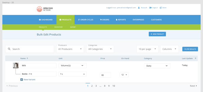
The next consequential step that should be handle is the new product list, which is a “big tables that show a lot of data with many columsn and take up a lot of horizontal space,”

So, I’d be happy if we can have an agreement around an existing CSS framework before starting the work. I think using such a thing (Tabler for example, I’d be happy to choose this one), could be an excellent solution : no need to reinvent the wheel, a clear list of existing components, less question around design (as we don’t have a designer). My concern is more about the co-existence between the old spree/OFN CSS and the new tabler one : how long can those two css can co-exists at the same time, in both technical level but also from a customer point of view.