We explored what other checkouts do in terms of user expectations, specifically around how many steps, where users can edit sections and what is needed in an order summary. Most of these aspects were talked about in our user testing research so we had qualitative evidence to inform our design approaches.
Our key scope/constraints were:
No huge structural User Interface changes to keep front end and back end dev reasonably quick and easy and try to use existing UI as much as possible.
The delivery details, payment fees and any ‘final’ payment summary must happen on different pages between button click to improve performance.
There must be an order summary page and it must be compliant to the “Double-Click-Rule”: EU law requires a checkout process to have an order summary page. Details on this law in the issue here.
We also tried to make these pages more ‘mobile friendly’.
You should be able to view the screens in a design software called Figma here.
Please note there are no changes in the edit basket, shop front-pop-out-checkout and final order confirmation page which is not included in the screens. The info included in delivery and payment sections have been compiled from various UK based OFN stores.
We’re looking for community feedback specifically on:
Are there any critical problems raised for your instances and/or producers in this work?
Within these screens, are there any key paths users take that are not covered?
We’ll conclude community feedback in 1-2 weeks depending on how quickly we get responses
I guess I may now?
First of all thank you for all the work you have put into this.
I have the following comments to make:
I really liked having the order summary in the right column (in your previous draft). Seeing the nice produce I am going to buy hepls to make it through the boring process of entering my details etc. - just my opinion.
These should be clear but to avoid misunderstandings when implementing:
On page “checkout - your details” with “collection” selected, the button “next - payment method” should be activated (all required information is there, isn’t it?).
On page “checkout - payment method” with “card / stripe” selected, the button “next - order summary” should be deactivated (card details not entered yet). But see comment regarding UX below.
Regarding clarity:
I find it very misleading, seeing a “Total” at the top of the page (order summary) and then all the fees are added only at the very bottom of the page - even in smaller font size. This should definitely be located all in one place (include fees in the order summary at the top of the page - all the info needed has already been provided on the previous pages).
The values of “Produce subtotal” and “Total” in the order summary are identical in your example. If this is the case, one should be left out - unless fees will be added in this summary too (see above).
Regarding UX:
Are the “tabs” (your details, payment method, order summary) clickable? They definitely should be, because this is what users would expect.
I believe the deactivated next-buttons are rather unusual in this situation. On the “your details”-page there is so much information to enter, that it is very likely to forget one field. Then you would wonder why you cannot click next, needing time to search, worst case leaving the page. The button should be activated and if required data is missing the corresponding field should be highlighted.
Required fields should be marked as such - I believe e.g. phone number is not always requried.
Looking forward to your feedback and I hope this helps getting the community discussion started.
@konrad makes some great points. Thanks for your contributions!
Agreed. Just stating ‘Produce Subtotal’ would be more accurate.
My only other thought is that it feels like a lot of scrolling. Will this increase the likelihood that some users will not complete their order because they can’t see the buttons to complete?
Firstable, thanks a lot for all your work done here !
It’s very nice, I like the breadcrumbs, I find it very clear and essential.
I do agree with @lin_d_hop with the feeling of a lot of scrolling. Can we imagine the information displaying in the with for desktop view and make it responsive ? Like for exemple for Your Details page on desktop view, having « Your details » and « Delivery » info on the left and « Billing adress » on the right side. Also to clarify the element disposition maybe we can put this elements on bocks ?
I suppose its probably difficult to add this features using our existing UI as much as possible but I find it really nice to be able to modify the product quantity, on Order Summary page with basic - an + and also to be able to delete products with a cross without having to go back to Edit basket
Also for the Order Summary page, I find it disturbing to having twice totals. Moreover different totals in two different places. Can we imagine gathering Your order and Order summary in the same block ? I think like this people will be confused.
Again, in the Order Summary page, Instinctively I’ll put the billing informations near to the « your order » but, its a nice to have for which one I’ve got no argument
For the last click : Complete Order, in France, it seems like a lot of customer forget to click on it, maybe we can think about make it bigger or something else, or maybe with this new design is not gonna be a problem anymore !
on the page that collects details - one of the things that has been a bug-a-boo (a little one) here for ages is that when there is no delivery or payment method fee applicable, the word ‘free’ appears to the customer beside the selection. Often enterprises have asked if that can just disappear - since it suggests the order is free. Just wondering if we could change ‘free’ to ‘not applicable’ because I don’t think this string is translatable right now (or at least I haven’t found it) Or make it translatable?
on the order summary page - can we say "product’ total or “order total” - many things besides produce in these orders… I think this IS translatable - so if Canada is the only instance that needs this, we can change it in transifex.
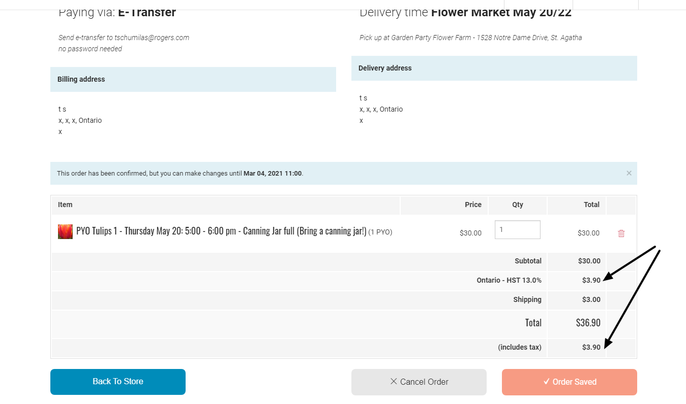
Bigger issue is that I want to understand how this new order summary page will appear for instances where taxes are NOT included in price. Because it is a list of items - to be legally compliant - we need to show taxes per item. (So same known issue we have with invoices where there is a list of line items) Right now, on the existing order confirmation page - we see a subtotal that does NOT include tax, then the appropriate tax line and tax total on the products, then a total - and the (rather confusing) addition of a redundant line that says ‘(includes tax’) See below>
How will this new order summary page look in these instances? Specifically - wll there be an additional column for the tax per item? Or a way that items that incur tax are indicated? I know we don’t have that line tax work completed yet - but should we anticipate it here, or just recognize we’ll have to re-do the order summary page when the line tax work is finished? @lauriewayne1 - not sure how big this is in the US …
Linking to this issue, regarding information on tax totals and different designs for order totals for ´
A) Instances with tax included
B) Instances with tax excluded
What have we done since the rounds of internal and community feedback?
As per a newer process that we’re trying around making sure we document and talk about the product processes here’s what we’re delivering into the development pipe:
We took into consideration the ‘double click’ button legislation and settled on a piece of text above the final ‘Complete order’
We thought about how to ‘reduce the scroll’ but don’t think this will be as much of an issue as we worry about but we’ll be doing some usertesting to be sure that customers don’t ‘get lost’ or ‘get bored’ with a scroll and everything works well.
We made improvements to the progress bar including check-marks and colour changes.
We doubled the Complete order CTA on the final page so that the shoppers can see the CTA up higher in the page.
We improved the layout of the ‘produce total’ table with the tax and fees breakdowns.
Generally improved visual hierarchy of text (H1’s, H2’s etc.)
Made sure we have good error handling across the fields we choose to be mandatory.
Good coverage of mobile sizes for these new elements.
At this point we are not taking on any more community feedback for this feature but if there are further conversations and improvements you can follow wishlist, papercuts and starting a discourse discussion thread for improving this feature.
We’ll also be doing some usertesting on this so that will also be published openly.
We had a design Product and Design were happy with and informed by usertesting.
We did 1 round of tech input and several rounds of community feedback.
We finalised and published the ‘designs ready to dev’
What we didn’t do was slow down and make sure tech and wider product were all happy. Turns out, there we’re some critical concerns about the design, so we opened it up for product and tech collab and got to this V4 design (above). This is an evolving process and definitely not perfect (and likely never will be!) but we agreed there were good reasons to ‘go back over’ some key details.
To further clarify, we’re not re-opening this V4 for community feedback. But we will explain clearly below what we changed and why.
Central layout and removing the ‘2 columns’. Early on we did designs that keep the 2/3 1/3 column layout. We decided it was too technically difficult to have what we ideally wanted (a mini edit basket) and removed it but didn’t consider earlier on moving to a centralised single column layout. We’ve now done this to reduce what was perceived as ‘empty space’.
Centralising in a single column for these kinds of forms is good for many reasons including: Focus on a single form field per moment which lessens cognitive loads for users and typically results in quicker form completion, lessens confusion for RTL and LTR languages and generally more accessible as a page structure for screen readers.
Colour and structure changes in the progress bar. Some of the design of the progress bar was concerning folks who felt it didn’t guide ‘they eye’ visually. The progress bar has now been changed to be both accessible in a WCAG sense but also visually balanced.
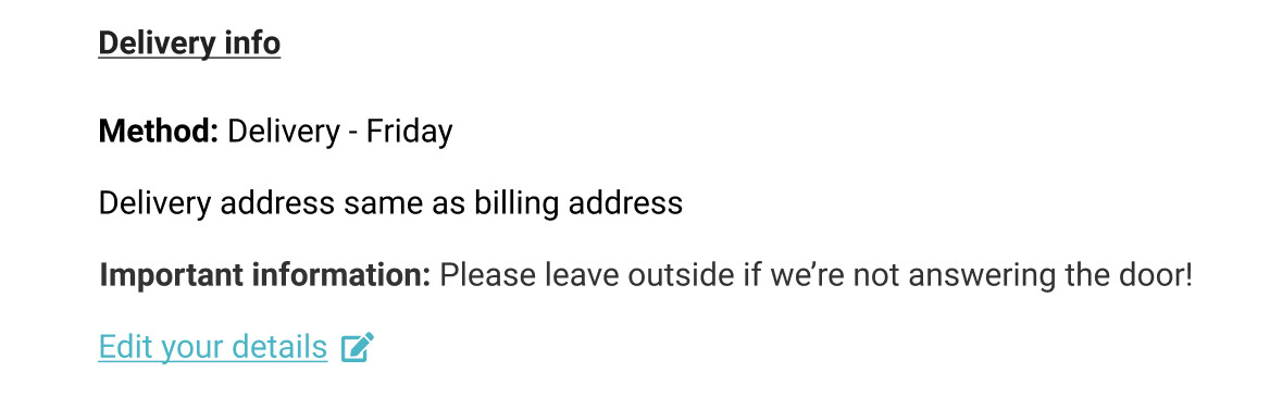
Delivery details in order summary - We noticed we had not included some key information about delivery/shipping methods in the order summary page which we’ve now added. Screenshot below:


