UX Upgrades

In the UK there is a huge need to upgrade the UX, particularly on mobile and tablet devices.

From a user perspective:

  • Hubs and producers need to be able to update products, order cycles etc from the field and kitchen on mobile/tablet.
  • Customers need to be able to buy on mobile and tablet in a quick and streamlined way.
  • Customers with old phone and browsers need to be supported as the main goal of a lot of our hubs and users is to make local food accessible to those on low incomes.

Issues Identified to Date

Bugs have been found using IOS on mobile and tablet using safari and chrome. Details here: https://github.com/openfoodfoundation/openfoodnetwork/issues/1092

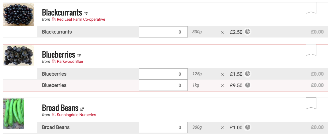
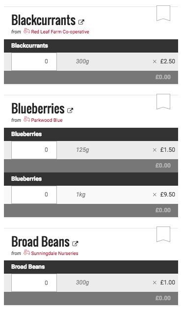
The page structure is very confusing on mobile devices. It’s hard to navigate, menus take up too much space, huge info bars take up the whole screen. The experience is not intuitive.

Android 5.1 with 512mb memory, average CPU - Shopfront is very slow to load. Clicking on the products does not bring up more information. Trying to add item to basket does not respond. Page becomes unresponsive. Nothing is added to my cart.

Competitor Analysis

I placed an order with Food Assembly using the same Android 5.1 average device above. The experience was simple, fast and easy. My local assembly was recommended to me as the prominent thing on the landing page. Menus and ordering intuitive, clear icons, menu pinned to bottom of screen. Products clearly displayed, only bare basic information but easy to click and find more. Payment is very, very easy, with one click payment being a much appreciated feature.

Please add any details of UI and UX experience here

What Next?

Funding UX improvements will be a challenge but something that the UK want to prioritise. We need skillz and ideally some cobudgeting.

Ping @MyriamBoure, @danielle

2 Likes

One of OFN UK’s non-exec directors is very concerned about the UX and his wife (a UX design specialist) has offered to have a quick look at https://openfoodnetwork.org.uk/ and make some suggestions. We will post a summary here when she gets back to us

2 Likes

Hi people

I read this with mixed feelings, but the predominant one is “yes I agree, there are some big issues here and it would be awesome to actually get some focus and movement on them!”

Fantastic that you have someone with ‘fresh eyes’ to have a look through. Would be really useful to get a sense of how much of the problem is related to:

  • User journeys / task completion e.g. people can’t work out what they need to do and easily get through to do it
  • Design implementation e.g. use of modals etc
  • How much is mobile specific, or is actually a broader problem that is exacerbated / ‘the last straw’ on mobile?

I guess the other thing is that we all realise that a responsive and design overhaul would be awesome, but likely expensive and may need to be a new ‘project’ e.g. co-budget.

Are there quick-fixes that are workable in the short-term?

Keen to have a good, active discussion around this. Ping @danielle @serenity @sstead

This would have a minor impact, relative to all the desired improvements listed above, but Danielle suggested that I should be testing on more devices, to stop mobile/tablet bugs getting through. Happy to do this, just need the devices.

Here is a specific from Jack - our director:

From: Jack Townsend [mailto:jacktownsend.net@gmail.com] On Behalf Of Jack Townsend
Sent: 22 July 2016 17:03
To: nick@openfoodnetwork.org.uk
Cc: Lynne Davis; support@openfoodnetwork.org.uk; Paul Mackay; Kia Coates
Subject: Re: OFN digital strategy workshop

Thanks Nick.

One particular piece of feedback that I agree with from the Farmers of the Future event, is that this products page looks neither exciting nor appetising (More like something from an accountancy program?) This particularly true on the mobile responsive page where horrible black blocks is all that’s visible. Better larger beautiful pictures of the produce that celebrate it’s quality and deliciousness, not unappetising thumbnails.

Will pass on for Andrea to look over.

@JackTownsend_ jack@jacktownsend.net


This also describes the idea of a grid view for the shop front.

A question - how many products typically have variants? If there are few (and maybe even if there are lots) would it make sense to show each variant as a grid item, rather than have the product with a variable list of variant selectors underneath?

I totally agree that the UX is not optimal on OFN, it’s sure that a design like Farmdrop or Goodeggs or http://www.lecomptoirlocal.fr/produits/fruits-legumes (super nice project in France!) is much more product centered and nice looking, and user friendly. but they don’t have the complexity of a marketplace design of course…
I guess it’s possible to have a “main product” and display in smaller bellow the item links to other package options (like 3 for 10$) that you can then choose in the product page (switch from a list of options)

It’s true that it would add a lot to the user experience, but it requires hub to commit to put pictures of the products, and good quality ones, which from my experience is not happening, especially with community hubs… what do you think about that in the UK? Do you think every hub will take the time and energy to put nice pictures for all products?

Also for me the front end UX is acceptable even if there will be work to do on it (although not valid on mobile device), but I think the UX for hub managers, back office experience, is much more problematic, I have to spend time with every new user and show them the back office, there are lots of small things which when you use first the platform is a bit hard to understand, lots of useless clics (like for every calculator you have to click once for the calculator to appear, it’s not dynamic, and all the people I support don’t understand, they clic once and don’t understand what’s happening…) I’ll start a discussion on it. From the feedback I get from beta testers, the front end is ok, but the back end is hard to get used to…

Our director Jack ran a workshop for us to get clearer about how we wanted OFN to come across to our potential customers. We are still working on this as a contribution to the UX improvements and would really value any input from our international sisters and brothers! Here is what we have got to so far - please make comments, changes, suggestions etc.
Thank you

Hi @Kirsten if you have time for a quick look at this google doc we would appreciate your input. Thanks very much

there was a thing that @summerscope used to use that i think enabled testing different devices and versions from browser? If Laura doesn’t see / respond to this I’ll email her to find out what it was . . or @RohanM @oeoeaio do you remember what it was?

hey guys -

yeah testing on real devices is best to get the real ‘feeling’ of how your
app responds, but you can find responsive & layout bugs easily using chrome
dev tools. see attached :slight_smile:

1 Like

hi - have had a quick scan and will have time for a better look next week. Some initial thoughts are that this is really useful, and also very helicopter . .

It seems to feed into bigger conversations about the mix between openfoodnetwork.org and local instances, as well as how some of the more ‘informational’ functions might be used (e.g. the stuff we’re talking about / doing here)

It seems to me like we’re operating in quite a few different dimensions which is part of why the ux is confused, and with what we’re doing above we’ve added a whole lot more!!

So for example from a customer perspective, you’ve highlighted info about why it matters, broken food system, this food is good etc as well as the shopping journey itself.

From a producer perspective, there’s stuff about shopping / selling . . but actually a part of what we’re trying to do here is also start showcasing ofn as a directory e.g. even if people aren’t using it for sales . . so that needs to be clear to both the customer and enterprise signing up. AND we have to do some work on actually making it work better as a searchable directory

The challenge to me is how we take all of this and work out
a) a process for making sense of and prioritising it all
b) getting good designer/s to help make it work
c) doing required changes

I think there are multiple projects in it, but it needs to be viewed as a whole first.

What occurs to me is that we have probably gone down the track of actually making the existing site (front-end) have more going on for enterprises, incl. in Australia the links to ‘learn’ (which is about food enterprise models etc) and ‘connect’ which has both a customer part (use OFN as a directory) and an enterprise part (forum / noticeboard).

So what we might actually be talking about is thinking about a new landing page / front-end that is designed JUST for customers and isn’t trying to meet all these needs . . it might have more of the ‘why food is important’ stuff and have a stripped back, cleaner shopping experience (learning from competitors?)

Also, with the possibility of starting to embed shops into other people’s websites, we could potentially explore / improve how all the surrounding info pathways work. I’m not sure how much we can experiment with display of shopfront and checkout etc as part of this process or not

there is also still the challenge of balancing front and enterprise experience . . i suspect the same amount of $$ would get us a lot more useability jump in the back (where @MyriamBoure is talking about)? i guess it comes down to who’s paying and what their priorities are!

sorry, that’s more a stream of consciousness than a well thought out response. I think the main thing is my feeling that we have a whole lot of nested ux problems and we need some way to break them out / down a bit!

1 Like

@Kirsten
Agree with all above. Customers need a stripped back experience. In the UK I think once we have the ability to embed almost all users will use this. The customer landing page will be for people who hear about OFN and not their local enterprise. My feeling is that we’d rather people DIDN’T hear about us and all traffic was coming through the local enterprises.

I think our two priorities in the short term should be mobile experience and profile only producers selling through other hubs experience.

  • Mobile is very important to facilitate the convenience we are trying to provide to customer.
  • ‘Profile only’ is important to the paying enterprises trying to reduce their workload by making it easier for producers to do some of the legwork themselves.

Uploading Products
For the profile only experience I think the most important consideration uploading and updating products. Ideally this could be done on mobile, via phone camera, in a simple and quick form.

Mobile
Key things that would enhance the mobile site are:

  • Removing the huge block screens and menus and driving straight into a products list on the shop page.
  • Remove the ‘Shopping Tranformed’ block on the choose shop screen. Would be great to just display a list of shops open near you using phone location.
  • Adding a simple menu glued to the bottom of the screen that allows you to do simple navigation from everywhere.

Home. Shop. Basket. Account. More.

This menu, if locked to the screen, would make the experience sooo much simpler. (At least it was when I used the food assembly site ;-))

Looks like we’ll be needing more mobile dev to do this though…
This looks like a useful bit of guideance:

a question about process for identifying and setting up open collective / co-budget projects (probably good to discuss this at next international hangout) . . at what point do we take a discussion like this and start setting up projects? Do we do it as a wiki page (new category) here first until everyone is happy with the spec, and then set up the project/s once we’re all clear what it is?
@danielle @MyriamBoure @serenity @lin_d_hop

@Kirsten I would say a bit in between, we discuss in Discourse and when a transinstances project needing fundings appear and we have an idea of budget, we create a cobudget and/or open collective, but I think it’s easier and more public to discuss here in Discourse than using extensivelly the “idea” functionnality of cobudget… We can discuss it on Tuesday yes.

yep cool . . I’m thinking a sub-category under wishlist for ‘project’ where we specify the project, and links to appropriate fund-raising spot

Yes, why not, I’m not sure we need really a sub category, but we can link the fund-raising pot in the discussion, like add it in the first message saying that this discussion have led to the creation of a pot to finance this feature… but anyway both work :slight_smile:

This thread became full of conversation very fast.

Can I propose we start a new sub-category within Wishlist -> ‘UX Overhaul’ so that we can try and capture ideas in separate threads? Not sure who has category creation permissions @Kirsten, @MyriamBoure?

The UK is willing to contribute funds toward the process of overhauling the UX. Managing this international process of UX redesign will be difficult. It would be great if we could do some work collectively and then use funds to develop wireframes and pay for front end dev. It would also be great to prioritise collaboratively.

As always, global collaboration will be a challenge. How’s this sound for a vague process:

  1. Separating out everyone’s desires from this and other threads into Wishlist -> UX Overhaul.
  2. Building discussion on specific areas for overhaul.
  3. Prioritise - discussion will likely self select priorities. The more voices in an area the higher the need.
  4. A smaller number of people consider the User Steps for the area in question, to streamline what the user is actually wanting.
  5. One (ideally skilled/expereinced/professional) person creates a wireframe for the area in question.
  6. Once wireframed devs can start developing the implementation.

@devincent @MyriamBoure @oeoeaio @danielle @sstead @Kirsten @NickWeir
Please ping everyone else. I’m out of the loop wrt the global community

Tthanks Lynne. I like your process and will contribute as I can. Should we involve Jack’s partner in this or not yet? Pinging a few more people at random. Who have we missed? @CynthiaReynolds @sreeharsha @Selmo @fraschelo

Jack’s partner has not given us anything yet in terms of contribution, so I imagine she is a busy one and we need to move along without her input.